7 Things You’re Putting on Your Therapy Website That Your Clients Hate

We’ve all visited therapist and coaching websites that are ugly and useless. Information that’s hard to find, there’s no clear navigational structure, and the design is just… BAD. It would be a miracle if these sites actually bring in clients.
But just because other therapists and coaches may have really lame websites doesn’t mean you should settle for less too. Take advantage of their shortcomings and learn from their mistakes to give your clients an enjoyable and usable site experience.
I’m breaking down 7 things you should eliminate ASAP from your private practice website.
#1: Vague Headlines and Section Titles
Headlines and section titles tell the reader what they can expect to find on the page or in that section. If your headlines and section titles are too vague, you won’t draw your readers into the rest of your content. This means they may not get the information they are looking for. An ideal client could slip right through your fingers.
Your headlines and section titles don’t need to be clever or creative. They need to be clear and descriptive.
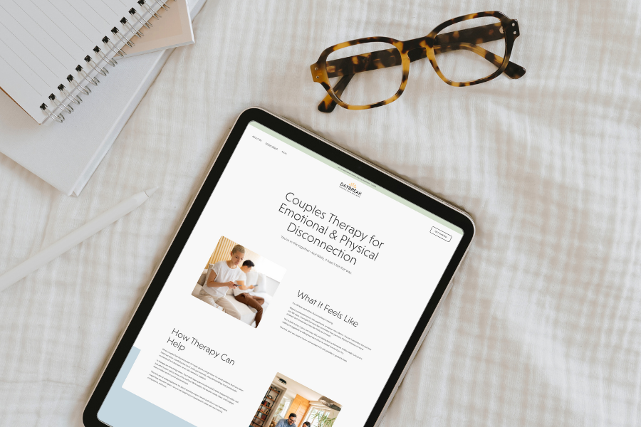
The first stage of writing good headlines and section titles is identifying what you want your audience to know. Let’s say you have a paragraph of text that describes your approach to therapy. You want readers to know that your approach is unique and compelling. Rather than naming the section “Approach,” draw the reader in by calling it “How I’m Different” or “What To Expect When Working With Me.”
#2: Nothing About Your Onboarding Process
Put yourself in the shoes of a potential client. She is struggling with something in her life, perhaps feeling desperate at this point, and she needs help. She’s feeling vulnerable, scared, and uncertain. She does an internet search and comes across your website. She reads through your content and decides that you are a good fit. She navigates to your contact page and completes your online form (or sends an email or leaves a voicemail).
Imagine what she is thinking at this moment. What does this potential client need right now?
She needs to know what will happen next! She wants to know if and how you’ll get back to her, if and how she will become your client, or if she needs to keep searching.
Give your new client peace of mind by describing your onboarding process.
Here’s mine:
After receiving your new client inquiry form, I will email you within a day or two to tell you if I think I am a good fit for what you need. If one of my available appointment times works for you on an ongoing basis (weekly), then I’ll hold the spot for you, and we will schedule a 15-minute phone consultation within the next week or so. The consultation is to clear up any questions or logistical issues before making you an official client. If everything is a go, I’ll add you to my client portal, secure your weekly appointment time, and invite you to complete the intake and consent forms in the portal. These are all digital and don’t require printing or emailing me anything. Before your first appointment (and every appointment after that), you’ll receive an email with a link to our video session.
Here’s another tip: You probably have a page on your website with your contact information or a new client inquiry form. Often, I see this page labeled “Contact” or “Contact Us.” This feels like a very passive way of inviting a potential client into your practice. It’s like saying, “Here’s the door, and come knock if you want to.”
You can make this invitation more persuasive by labeling this page something like “Get Started” or “Become a Client.” It’s like saying, “Hey, the door is open! Come in! We welcome you!”
#3: No Information About Your Focus Areas
Searching for a therapist sucks. Clients don’t want to do 10 phone consultations to get the information they could get from your website. If your content doesn’t indicate what you do or the types of clients you work with, you’re making it much harder for a client to find a therapist. You could miss out on serving some of your best-fit clients, all because they didn’t realize it!
Don’t hide this information behind the home page. In other words, don’t make your audience go looking for it. Make it obvious on your home page that you serve a specific population or problem area. Then create individual pages for each of your focus areas that your home page links to.
#4: Outdated Information
Imagine I owned a candle shop. It’s March, and you walk by my shop and see Christmas candles, Christmas displays, and Christmas promotions. Not only would this be confusing, but you’d seriously question my credibility as a candle maker and business owner if I hadn’t updated my window display in three months. You’d probably wonder if I was even open for business.
The same goes for your website. Think of it as your window display. It’s the first thing potential clients will see, so you want to make a killer first impression. Be sure to update your website often with new headlines, better copy, new blog posts, new offerings, etc.
#5: Clever Navigation Titles
There is a trend going around where therapists label their Fees page with the term “Investment.” I’m all for reframing the way clients view fees, but when they are searching for how much your services cost, they are looking for the words “fees” or “rates.” Don’t create an extra step for their brain to process what “Investment” means.
The same goes for your other navigation titles. Keep it straightforward so that clients can quickly move through your site, finding the exact information they are looking for. Don’t stray from standard navigation labels like Home, About, Blog, Fees, etc.
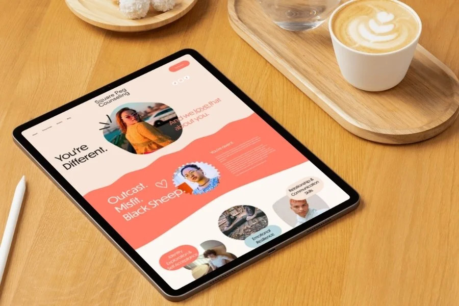
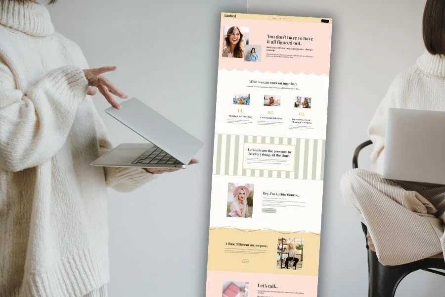
#6: Bad Stock Photography
I know, I know… you’ve heard me say this one a million times. But c’mon folks, this one is easy to fix. With directories like Unsplash.com and Pexels.com, you can get access to fantastic, high-quality stock photos for FREE. Please stop using pictures of sunsets, rainbows, stacked rocks, and people with their arms in the air yelling, “I’m freeeeeeee!” Why? Because these types of photos are so overused that they’ve lost their impact. This means that your clients will probably ignore them.
Everything on your website should say something.
I generally recommend that you use photos of people representing your ideal client and show them in situations that demonstrate where they want to be. In other words, don’t include pictures of sad and depressed people. Your website visitors will feel more connected to you if the people on your website reflect who they are and the direction they want to go.
If you’re against having people on your website, then use photos and images that evoke emotion, relate to your content, and connect to your ideal client somehow. For example, if you work with women and mothers, you might include photos or graphics viewed as stereotypically feminine - perhaps shades of pink or images that evoke nurturance, sensitivity, empathy, and tenderness. Of course, the defining characteristics of femininity vary between and even within societies, so be sure to think through who your ideal client actually is and what they will connect with.
#7: Broken Links
There’s nothing more frustrating on a site than wanting to read something but being unable to. Go through your site regularly and check every link. If all your links work—great, your potential clients will be happy. If you have broken links, fix them ASAP.
Want a quick way to check for broken links on your site?
Go to https://ahrefs.com/broken-link-checker and type in your website URL (it’s free). You’ll receive a list of all the pages with broken links. As you add more and more content to your website, you’ll often want to check for broken links.