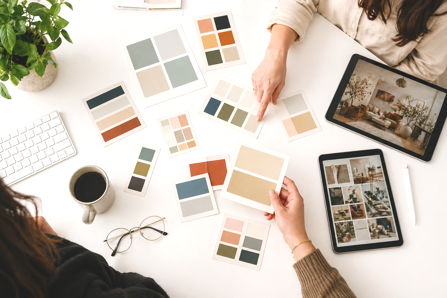
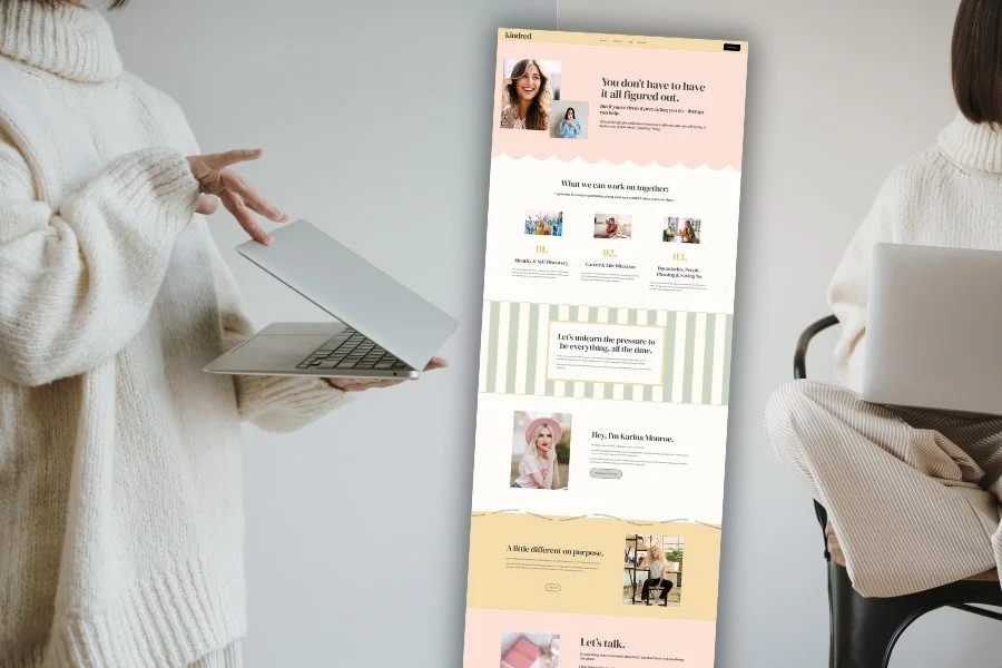
One Website. 10 Color Palettes.
Are you feeling stuck designing your therapy website because you want it to look “cool” or “designer-quality”? Here’s a secret: the layout doesn’t need to be complicated. A simple, strategic design can go a long way—especially when you harness the power of color. In this post, I’m showing you just how dramatically a single website can shift its entire vibe with nothing but a change in color palette.
Same layout.
Same typography.
Same content.
Just color.
Color is more than decoration—it helps potential clients get a feeling for you before they read a single word. Are you calm and grounding? Bold and energetic? Inviting and creative? Color is one of the most effective ways to communicate your tone, values, and even your specialization. A soft neutral palette might speak to someone healing from trauma. A vibrant mix might connect with teens or creatives.
And that’s the beauty of using a minimalist website template—it’s not boring, it’s versatile. It gives you a clean, focused structure to work with, and color is one of the easiest ways to make it feel fully custom. Think of your template like a canvas. Let color do the heavy lifting when it comes to personality and emotional tone.
Now, let’s get into it!
One Website. 10 Color Palettes.
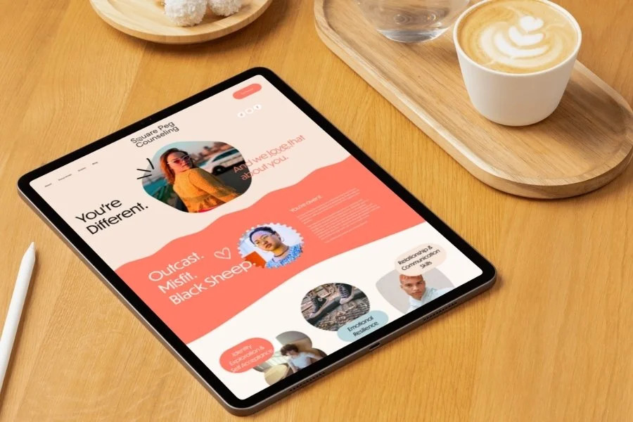
Click on any image to expand it!


So if you’ve been stressing over making your website “stand out,” take a deep breath. You don’t need a flashy design or endless customization to create something that feels like you. With the right color palette, even the simplest layout can become a strong, expressive brand presence. Let this blog article be your permission slip to have fun with color, stay focused on clarity, and trust that simplicity + personality is always a winning combo.
Need More Inspiration?
Check out these popular inspo posts:
8 Inspiring Therapist Website Examples You Need to See Right Now (2025)
5 Examples of Gorgeous Therapy & Coaching Websites to Inspire Your Design
My Favorite Design Hacks for Customizing Your Squarespace Website
From Calm to Captivating: 10 Unexpected Color Palettes for the Modern Therapy Website
10 Brilliant Examples of Hero Sections for Your Therapy Website Home Page
10 Gorgeous Color Combinations to Try on Your Therapy or Coaching Website
24 Awesome Brand Moodboards to Inspire Your Therapist Website Design

Pin it!


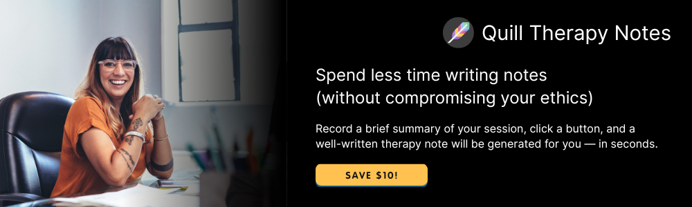
Some of My Favorite Private Practice Tools
Resources and Referral Links