How to Use Color and Imagery to Reflect Your Therapy Brand

Your private practice website is the virtual front door to your therapeutic services. It's not just about conveying information but also about evoking emotions and creating a meaningful connection. In this article, we'll explore how therapists can use color and imagery to reflect their brand effectively.
1. Understand Your Audience
One common mistake therapists make is selecting visuals based on personal preferences or trendy choices rather than considering their ideal client's needs. Remember, your website is primarily for your clients, not yourself. Think about what visuals will appeal to and comfort your target clients. This approach ensures that your website will resonate with those seeking your services.
2. Branding Elements and Themes
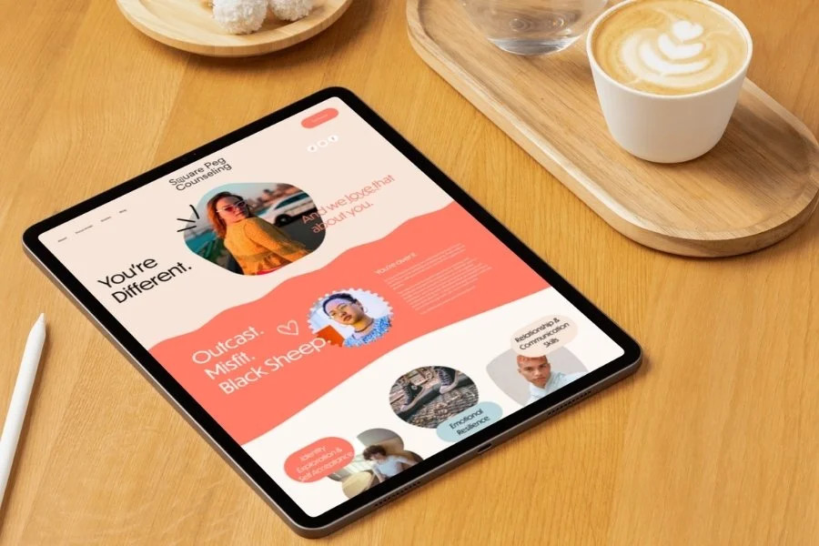
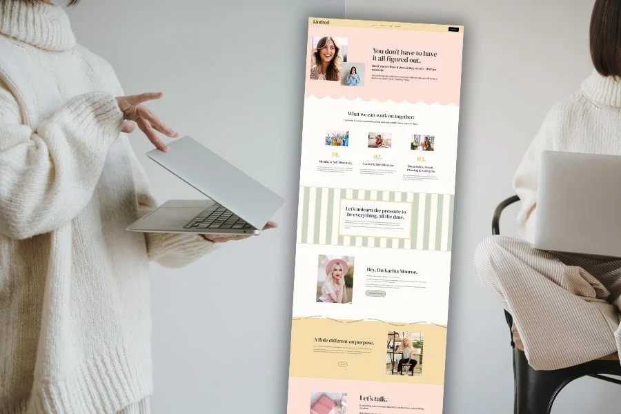
Every therapist's brand is unique, and your website is a great place to showcase your branding elements. These could be colors, fonts, logos, or graphics representing your practice or ideal clients. For example, you might already have a specific graphic that resonates with your brand's message, such as a lotus or tree. These branding elements can help create a cohesive and memorable image for your practice.
3. Evoke Emotions & Connection
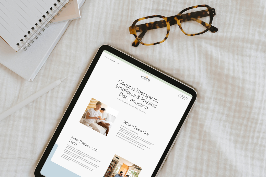
Color and imagery are powerful tools for conveying emotions and creating connection. Consider using color psychology to connect with your audience. For instance, a soft pastel palette can evoke comfort and serenity, while bold, vibrant colors may convey energy and enthusiasm. Likewise, imagery can tell a story and evoke emotions. A calm, serene landscape might promote relaxation, while a bustling cityscape might reflect a dynamic, problem-solving approach.
To help you get started, here are examples of a color palette and imagery choices for different emotions:
Calm and Comforting: Pastel blues and gentle images of nature or water can create a soothing atmosphere.
Invigorating and Energetic: Bright oranges or yellows paired with images of people in action can inspire a sense of vitality.
Thoughtful and Reflective: Muted earthy tones with images of tranquil scenes can convey a contemplative mood.
4. Portray Positivity and Wellness
Avoid using imagery that portrays sadness, depression, or anxiety on your website. Potential clients want to see that therapy can lead to positive outcomes, so opt for imagery that shows people living fulfilling lives and being happy. This can help to reduce the stigma surrounding therapy and make potential clients feel more hopeful about seeking help.
5. Case Study: The Mindful Path LLC
Let's look at a practical example of a well-designed therapist's website, The Mindful Path LLC. This website, created for therapist Rachel Rengifo, Ph.D., effectively incorporates 1) A feminine color palette that balances vitality (bold colors) and serenity (soft colors); 2) Imagery that her ideal clients can see themselves in; and 3) Little star graphics that are both playful and tasteful. By focusing on the target audience (moms) and maintaining a positive tone, this website successfully reflects Dr. Rengifo’s brand and invites visitors to explore further.
Your private practice website is an opportunity to showcase your unique brand and connect with potential clients. By understanding your audience, using branding elements, and carefully selecting color and imagery, you can evoke the emotions that resonate with your ideal clients. Crafting a website that truly reflects your brand will not only attract clients but also create a lasting impression of your therapeutic services.