24 Awesome Brand Moodboards to Inspire Your Therapist Website Design

Some therapists light up when they start thinking about branding. Others spiral into decision fatigue somewhere between "muted terracotta" and "rounded sans serif." Wherever you fall, just know this: you don’t need to overthink it.
Branding can absolutely be fun—but it doesn’t need to be deep and layered to be effective. In fact, the simpler you keep it, especially in the early stages of your business, the easier everything else will be. Clarity helps your message land. Simplicity helps you move forward.
The #1 Branding Mistake I See? Doing Too Much.
Here’s the truth: your brand doesn’t need five fonts, a color palette with twelve swatches, and a hand-illustrated botanical line drawing in the footer. When therapists try to bring in every visual detail they’ve ever loved, the result is often confusing and inconsistent.
The best brands start small and build slowly. Think of it like a capsule wardrobe—you want a handful of elements that work well together, feel good to use, and support the kind of space you want to create for your clients.
“Should I Choose What I Like or What My Clients Will Like?”
Ah yes. The classic branding dilemma. And one of the most common questions I hear.
The short answer: yes and yes. But the longer answer is this—start with your client. Your brand is ultimately a communication tool. It’s your first impression, and your chance to say: I see you. I made this space for you.
Of course, you should still like your branding. But if you're torn between a soft neutral palette that feels welcoming to your ideal clients, and a high-contrast, maximalist aesthetic you personally love, go with what will help your clients feel safe, seen, and ready to reach out.
How to Use These Moodboards
Below, you’ll find eight branding categories. Each one has three different moodboards, and you can click on any of them to view them full screen. These are curated specifically with therapist websites in mind, and each one shows a suggested color palette, typography pairing, and overall vibe.
Whether you’re designing your brand from scratch, choosing a website template, or just trying to get inspired, these boards are a great place to start. You don’t need to get every detail perfect right now. Just notice which ones you’re drawn to—and which ones feel most aligned with the kind of experience you want to create for your clients.
Neutral
Calm, clean, and minimal, these brand boards feature soft colors, lots of white space, and subtle typography. Ideal for therapists who want a spacious, grounded, and timeless visual feel.
Click any image below to expand.


Fresh & Modern
These boards pair bold or refined color palettes with clean, contemporary fonts. Great for therapists who want a fresh, professional look with personality.
Click any image below to expand.


Fun
Bright colors, playful fonts, and cheerful energy define this category. These brand boards work well for therapists who want to feel approachable, creative, and upbeat. They are also awesome if you work with younger populations.
Click any image below to expand.


Classic
Timeless color schemes and elegant serif typography create a polished, trustworthy impression. This style suits therapists who want a refined and enduring brand aesthetic.
Click any image below to expand.


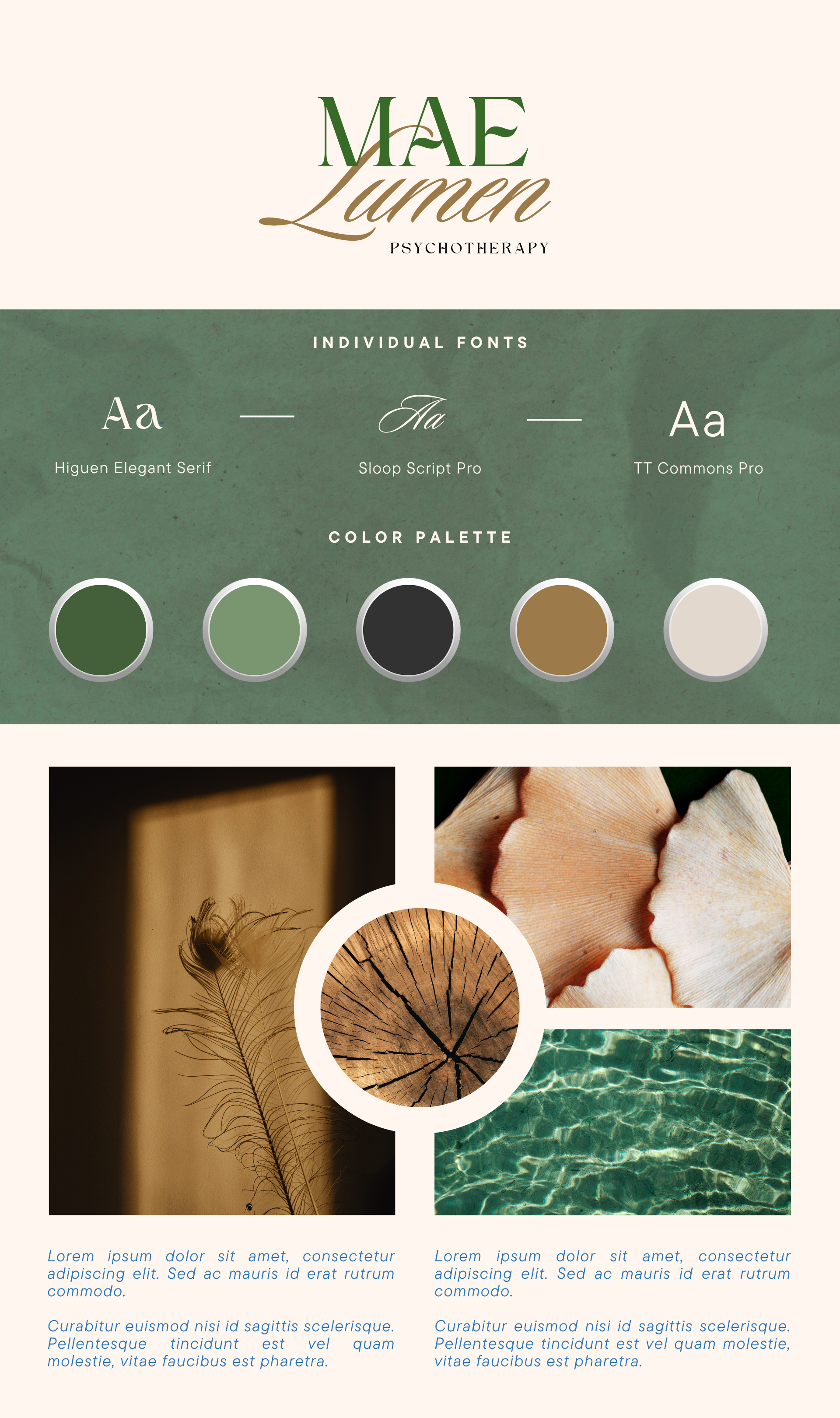
Moody
Rich colors, high contrast, and expressive fonts give these boards a bold, grounded, and introspective vibe. A great fit for therapists who want to stand out while still feeling professional.
Click any image below to expand.


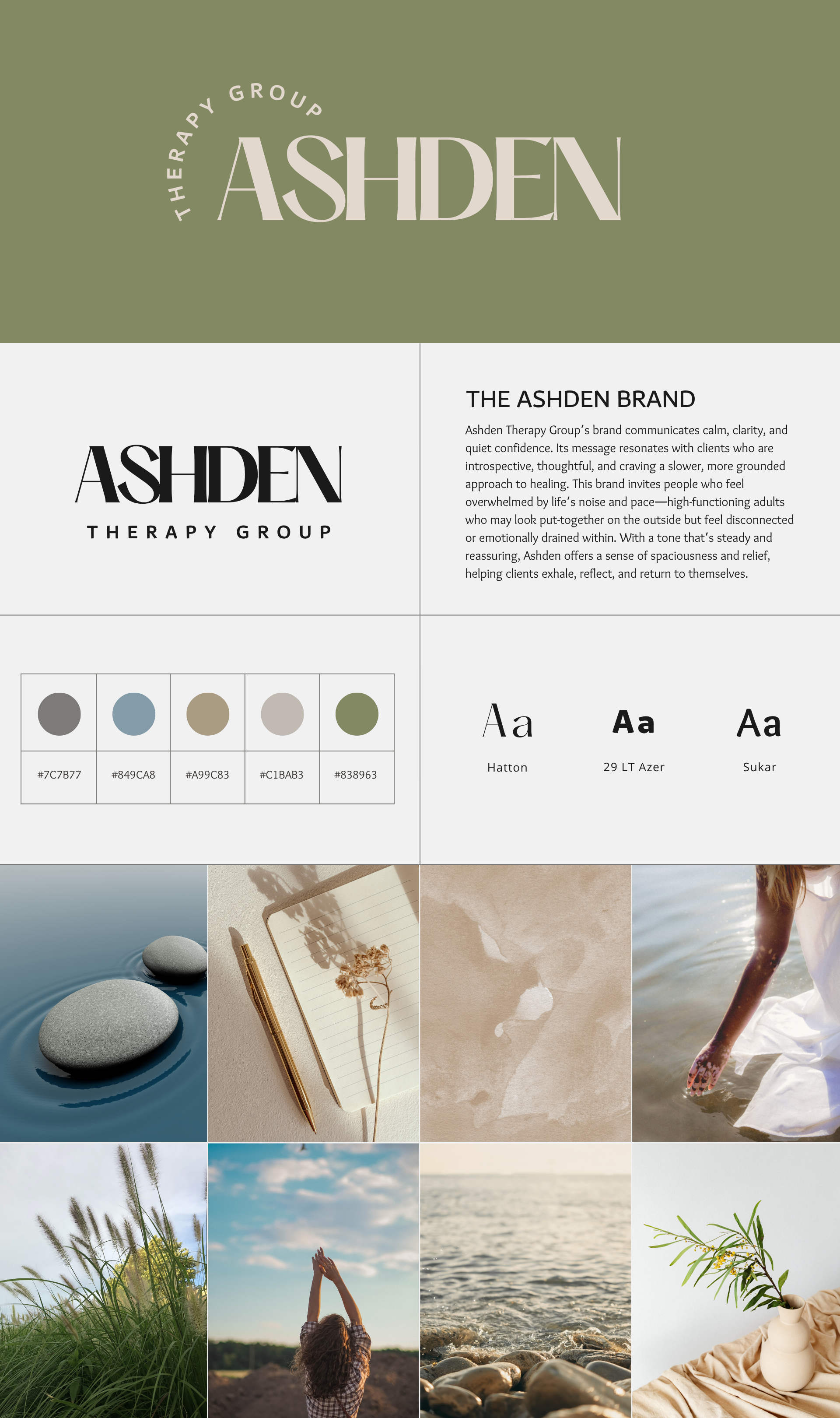
Boho
Earthy tones, organic textures, and relaxed, eclectic fonts give these boards a grounded yet creative vibe. Perfect for therapists who want a warm, soulful, and slightly unconventional aesthetic.
Click any image below to expand.


Bold
High-impact fonts, vibrant colors, and striking imagery come together to create a confident, unmistakable presence. These brand boards are perfect for therapists who want to make a strong first impression and stand out from the crowd.
Click any image below to expand.


Niche
Distinct and outside-the-box, these brand boards don’t follow a single visual style—but they all make a statement. From earthy to artsy to playful, this category is all about uniqueness.
Click any image below to expand.


Final Thoughts: Keep It Simple, Let It Grow
You don’t need to get it all right the first time. Choose a direction that feels clear and intentional—something that helps your ideal client feel understood from the moment they land on your site. You can always evolve later.
Branding is just one piece of building a practice that reflects your values and vision. But when it’s done well, it becomes the foundation for everything else—your website, your social media, your marketing, your voice.
Want help turning your favorite moodboard into a full website?
Check out my One-Day Website service or explore my templates. Whether you want custom design or a stylish shortcut, we’ll bring your brand to life—without the overwhelm.

Pin it!


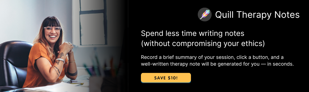
Some of My Favorite Private Practice Tools
Resources and Referral Links