Let’s Argue: 21 Things I’ll Tell You to Change on Your Website (and Why You’ll Thank Me Later)
Or, as I like to call it: the design hills I’ll die on.
Because yes, we’ll laugh – but also, I’m right.
I love collaborating with therapists on their websites. I really do. But somewhere between “I hate writing about myself” and “I’m not sure about that stock photo,” I start to see the same patterns over and over.
If we’ve worked together, you’ve probably heard me say one of these before. If we haven’t, consider this a peek behind the curtain at the most common things I lovingly argue about with therapists (and why I will continue to, forever).

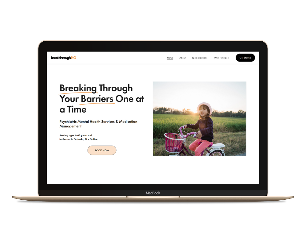
1. Photos of Real Clients Belong on Your Site
No, it doesn’t look weird. No one thinks they’re your actual clients. Showing people who look like your ideal clients helps potential clients picture themselves working with you. That’s what creates connection!
2. Happy Clients Are Allowed
You can have joy and depth. It’s okay to show photos of people who look relieved, calm, or even smiling. It tells visitors there’s hope – therapy works.
3. You Can Talk About Benefits
You’re not promising miracles. You’re explaining what might improve when someone starts therapy with you. Clients want to know the “so what?”; what they’ll get out of showing up.
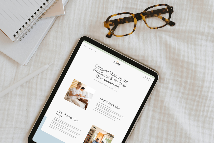
4. Your Website Needs a Clear Path
Don’t just toss every possible detail on your homepage and hope people figure it out. Guide visitors intentionally, like a therapy intake form, but prettier. Every page should lead to the next step.
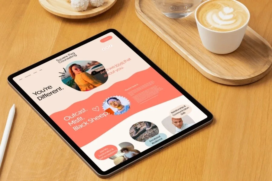
5. Four or More Specialties Is Not Too Many
Having separate pages for each specialty isn’t “extra,” it’s SEO gold. Google can’t guess what you do. It needs clear, specific pages to match you with the right search terms.
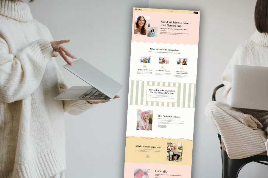
6. Your About Page Should Feel Human
Your degrees matter, but they’re not your personality. Clients want to know there’s a real person behind the license. They want to know that you are someone who gets what it’s like to be human, not just someone who studied humans.
7. Choose One Clear Way to Contact You
If your contact section has six buttons, two phone numbers, and an “or” after every sentence, it’s too much. Guide people to one easy next step. Confused people don’t convert.
8. Centered Paragraphs Are Not a Design Strategy
Just because you can doesn’t mean you should. Long centered text is hard to read. Alignment is your friend.
9. Service + Location Belong on Every Page
If you want to show up in search results, you have to actually say what you do and where you do it – multiple times. “Therapy for Anxiety in Seattle” beats “Welcome to My Practice” every time.
10. Metadata and Alt Text Matter
It’s not busywork, it’s accessibility and SEO. Metadescriptions help Google understand your pages, and alt text helps everyone (including screen readers) understand your images.
More on this: How to Write Meta-Descriptions: Maximize Click-Through Rates in Search Results
11. Keywords Are Your Friends
You can write like a human and optimize for search. If you never say “depression therapy,” Google will assume you don’t offer it — even if it’s your whole practice.
12. Know the Purpose of Your Website
Your site can’t do everything. Pick one to three main goals, like attracting new clients, establishing credibility, or selling something. Let those guide every design and copy decision. If it doesn’t support one of those goals, it’s just clutter.
13. Consider the Buyer’s Journey
Visitors aren’t ready for a dissertation. They’re still deciding if they like and trust you. This isn’t the time for crisis resources or a cancellation policy. Give them what they need now, not what you need later.
14. Cohesion Beats Chaos
Different layout on every section? Five heading sizes? Inconsistent spacing? It doesn’t look “custom,” it looks confused. Cohesion = trust.
15. Quote Blocks and Poems Don’t Convert
You love Mary Oliver; I love Mary Oliver. But nobody is connecting with poems and quotes like you are. Use those words on Instagram, not in your website.
16. SEO Is Not Magic
It’s not “if you build it, they will come.” You need intentional structure, links between pages, and actual strategy. Your website is not a diary. It’s a marketing tool.
17. Connect Your Google Business Profile (and Use It Right)
If you want to show up in local searches or on Maps, you need a properly set-up Google Business Profile. Add categories, update your hours, and upload photos. It’s free visibility you’re probably ignoring.
18. Design for Your Clients, Not for Yourself
You might love muted beiges and minimalist fonts, but if your ideal client is a creative 30-something woman in burnout recovery, your site shouldn’t look like a law firm. Design for them.
19. Calm Isn’t the Only Vibe
Not every client wants to feel like they’ve wandered into a meditation app. Sometimes bold, playful, or colorful is more authentic to your work. Soothing isn’t always the answer.
20. White Space Is Not Wasted Space
White space is breathing room. It’s what keeps your site from feeling like a crowded waiting room. If you’re allergic to blank space, take a deep breath. Your readers need it.
21. Repetition Is Good
You can repeat your niche, your location, and your call to action without it being redundant. It’s clarity, not clutter. Visitors skim, so repetition helps what matters stick.
In Summary: I Argue Because I Care
If it seems like I’m opinionated about therapist websites, it’s because I’ve seen what works. These “hills” aren’t about aesthetics, they’re about connection, clarity, and helping your clients find you.
You don’t need to follow every trend or master every SEO tactic. You just need a site that speaks directly to the people you help, and a designer (hi!) who will lovingly argue with you until it does.
Ready for a Site That Gets It Right?
If you’re reading this and thinking, “yep… guilty of at least five of these,” don’t worry — I can fix that. My Custom One-Day Websites are built to capture your voice, showcase your specialties, and skip all the common therapist-site mistakes.
Click the button below to learn more and see if a one-page site is the perfect fit for you.

Pin it!


Some of My Favorite Private Practice Tools
Resources and Referral Links