6 Therapist Website Examples That Get Clients and Stand Out Online

Curious what makes a therapy website truly shine?
In this post, I’m sharing a selection of sites that do just that—beautiful, functional, and client-focused spaces therapy websites. From clean, minimalist designs that let the copy breathe, to bold, personality-packed brands that immediately speak to your ideal client, each of these sites has something unique to offer. You’ll see how thoughtful layouts, clear navigation, and carefully crafted copy work together to create websites that aren’t just pretty—they guide visitors, build trust, and make taking that first step toward therapy feel approachable. Whether you’re in the early stages of building your site or just love exploring inspiring examples, there’s something here for you.
Zane Counseling

Zane Counseling’s website immediately feels approachable and welcoming, striking a perfect balance between professionalism and warmth. Right from the homepage, the clean layout and soothing color palette—soft neutrals punctuated with calm accents—instantly put visitors at ease. The use of high-quality imagery of people in natural, relatable settings helps create connection before a single word is read. It feels like the site is saying, “We see you. You’re in the right place.”
The copy throughout the site is thoughtful, concise, and very reader-friendly. The homepage hits a sweet spot—descriptive enough to convey expertise and specialty areas, while still feeling personal and conversational. I love how the language focuses on real human experiences and emotions, making it very easy for potential clients to relate.
Navigation is intuitive and smooth. The main menu is straightforward and keeps all the essential pages within easy reach. I particularly appreciate the logical flow from learning about services to reading more about the therapists, then easily scheduling a session. It feels seamless without being pushy.
From a conversion perspective, the CTAs are gentle but clear. “Schedule a Session” and contact options are always accessible without feeling spammy. The site structure encourages exploration while gently nudging visitors toward taking the next step. Small touches like the contact page form being simple and distraction-free show real attention to user experience.
In terms of SEO, the site shows some strong foundational work. Each service page is clearly titled and speaks directly to the client’s needs, which is great for search relevance. The copy includes natural variations of common keywords (like anxiety, stress, counseling, therapy), and the URL structure is clean and descriptive.
Overall, Zane Counseling’s website is calm, clear, and very human-centered. It doesn’t try to be flashy, and that’s exactly its charm. The thoughtful copy, cohesive design, and smooth navigation all work together to make visitors feel seen, understood, and ready to take the next step toward support. It’s a strong example of a counseling website that prioritizes real connection.
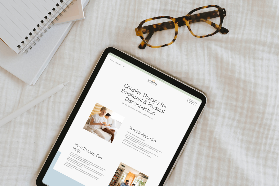
Daybreak Counseling & Wellness

A High Five Design Co. Custom One-Day Website
Daybreak Counseling & Wellness is a wonderful example of how simplicity, clarity, and personality can come together to create a truly inviting online space. The design is calm and modern without ever feeling cold—the color palette, typography, and layout all work together to gently guide visitors through the site. Every section has room to breathe, so the copy stands out beautifully, and you can feel the therapist’s warmth and expertise shine through without it feeling heavy or clinical.
I had the pleasure of working with Lilly on this custom site. She embraced the process of defining and “owning” her clinical focus areas, and even though she works with multiple populations and challenges, the site still feels cohesive and intentional. The individual service pages are clear and compelling, and the About section gives a real sense of her personality and approach, making it easy for visitors to feel seen and understood right away.
The little details make this site feel thoughtful: the gentle calls-to-action, the readable layouts, and the balance between professional credibility and approachability all create a seamless experience. Overall, this site does a beautiful job of making therapy feel accessible, safe, and human—while still reflecting Lilly’s expertise and unique style.
Fig Tree Counseling

Fig Tree Therapy’s website is a lovely example of “less is more.” The minimalist, modern design immediately gives a calm, uncluttered vibe, which makes the copy feel easy to read and absorb without any visual distractions. I love the subtle pops of color and the way the whitespace gives each section room to breathe—it really communicates a sense of ease and presence that aligns beautifully with therapy.
Standout moments include the gentle rollover effect as you scroll and the way the “Work With Me” page breaks the process down into clear, digestible steps—so intuitive and reassuring for someone who’s just considering therapy. The use of short, warm paragraphs paired with soft typefaces gives the site a friendly, approachable tone without ever feeling too casual or unprofessional.
Navigation is straightforward and simple, which reinforces the calm, uncluttered feel. It’s easy to find key pages like About, Contact, and Services, which keeps the user experience smooth. The contact form is clean and approachable, encouraging action without pressure.
Some small tips for leveling up: a professional headshot could make the About page feel even more polished and personal, and separating specialties into their own pages could help with SEO while giving each area more space to shine.
Overall, Fig Tree Therapy is a beautifully clean, welcoming site that makes exploring therapy services feel effortless. It showcases how simplicity and clarity can make a website feel incredibly professional and inviting.
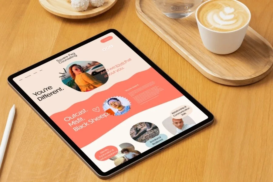
Keri Knight, LCSW
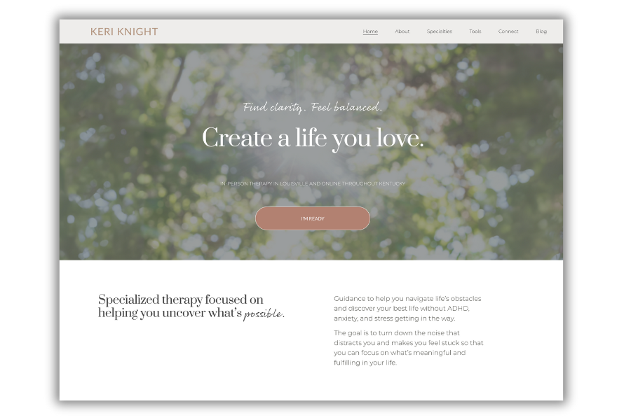
Keri Knight’s website is a strong example of clean, purposeful design paired with copy that hits right where it needs to. The layout feels open and uncluttered, which makes it easy to focus on the content without getting lost—especially impressive given how many resources and extras are included. Each section is short, digestible, and warm, which gives the site a friendly, approachable tone without ever feeling diluted.
Standout moments include the ADHD and Individual Therapy pages: the copy is sharp, clear, and immediately tells a potential client what they can expect, making it feel like Keri really gets her audience. The “About Me” section feels personal and grounded, showing her expertise without being overly formal. The site’s structure, with subtle use of white space and visual hierarchy, helps you move from page to page effortlessly, so it’s easy for someone to find exactly what they’re looking for.
It looks like a couple of areas may still be in progress—specifically, under Specialties > Resources and Tools, the “work” button doesn’t go anywhere, and the main navigation’s “Tools” item isn’t linked yet. Even with that, the overall experience is smooth, and it doesn’t feel confusing at all, which is a testament to the clear layout and well-organized content.
Overall, Keri’s site balances richness of resources with simplicity, making it a welcoming, professional, and easy-to-navigate space for clients. It’s a lovely example of how clean design and impactful copy can coexist beautifully.
Pam Snyder, LCSW

A High Five Design Co. Custom One-Day Website
Pam Snyder’s website is a serene, inviting space that immediately feels calm, safe, and welcoming—the perfect reflection of the care she brings to her work. The soft blue palette sets a gentle tone without ever feeling cold or clinical, and the clean, approachable design makes it effortless for visitors to navigate. Prospective clients can easily explore her services, specialties, and therapy intensives, and the “Get Started” section makes taking that first step feel simple and achievable.
I had the pleasure of creating Pam’s site as a One-Day Website client, and I left the process in awe of the work she does. Her passion for supporting clients and the depth of her expertise shines through every page. The specialty pages are concise, empathetic copy offers validation and hope, flowing naturally from one section to the next while still feeling deeply personal. Her About page beautifully ties her experience and approach to the client’s journey, building trust and connection from the very first glance.
Since taking ownership of the site, Pam has confidently made small updates on her own, which speaks to both the site’s usability and her comfort with it. Overall, the site balances a soft, soothing aesthetic with client-focused clarity, creating a space that is not only professional but also brimming with warmth.
Liberated Vision

Liberated Vision is such a powerhouse of a website—it immediately screams intentionality, creativity, and personality. From the moment you land on the homepage, you get a sense that the therapist behind it is bold, confident, and fun, but also deeply professional. The design is modern, polished, and cohesive, with pops of personality that make it feel alive without ever feeling messy. The branding is crystal clear—every color, font choice, and visual element reinforces who LaTasha is and the kind of clients she wants to attract.
The copy is engaging and distinctive. That line about “this isn’t therapy (and it’s also not your mama’s coaching)” is pure gold—bold, clever, and immediately differentiates her from anyone else in the space. The distinction she makes between therapy as healing/repair and coaching as skill optimization is smart, clear, and memorable. It’s the kind of messaging that builds trust while also making you sit up and take notice.
The multimedia elements are so good. Her videos and photos are top-tier—professional, approachable, and full of energy. You can tell there’s been a serious investment, and it pays off in how alive and relatable the site feels. Navigation is simple and intuitive, and even with a variety of offerings—the structure is easy to digest.
My favorite part is the way LaTasha is how incredibly clear her brand is. No matter your clinical focus areas, you can create a website that speaks to your ideal clients with this same level of clarity and persuasiveness.
It’s hard not to admire the ambition, investment, and precision here. This is the kind of site that makes other therapists think, yes, this is possible, I can do this too.


Some of My Favorite Private Practice Tools
Resources and Referral Links