Why Your Therapy Website Isn’t Getting You Clients (And It’s Not Your SEO)

Why Your Therapy Website Isn’t Getting You Clients (And It’s Not Your SEO)
Quick Answer (for the skimmers and search engines):
If your therapy website isn’t bringing in clients, it’s usually not your SEO. The real culprit is almost always the “get started” process: when the path to booking feels confusing, hidden, or effortful, visitors leave before contacting you.
But here’s the thing:
That’s only the tip of the iceberg. The way your homepage links flow (or don’t), whether you give too many options, and how you explain the next step all play a role in whether someone clicks “Book Now” or quietly exits your site.
In this article, I’ll show you the most common website roadblocks that stop potential clients in their tracks—and how to fix them so your website actually does its job: turning visitors into paying clients.
If your caseload has slowed down, it’s tempting to go straight to the usual suspects:
My SEO must be bad.
No one in my area can afford my fees.
My copy must be the problem.
Sure, sometimes those things matter. But after reviewing hundreds of therapist websites, I can tell you there’s another culprit that’s far more common — and it’s quietly killing your conversions.
It’s not your niche. It’s not your rates. It’s not your homepage headline.
It’s your getting-started process.
The Hidden Client Killer: A Clunky Start Process
Think of it like shopping online. You’ve found the perfect product. You’re ready to buy. But the “Add to Cart” button is buried, the checkout takes 12 screens, and the payment form won’t load on your phone. You’d probably abandon the whole thing.
Therapy is no different. Someone lands on your site because they want therapy — or they’re at least seriously considering it. But if your process is unclear, anxiety-inducing, or just too much effort, they’ll hop off and find someone else.
Common Process Roadblocks That Drive Potential Clients Away
Here are some of the biggest issues I see when it comes to guiding a potential client from “interested” to “booked.”

1. No Clear Path from the Home Page to Action
Your homepage should guide people toward one obvious next step. But many sites scatter buttons and links everywhere — blog posts, about page, social media — instead of pointing to the action that matters most: starting therapy with you.
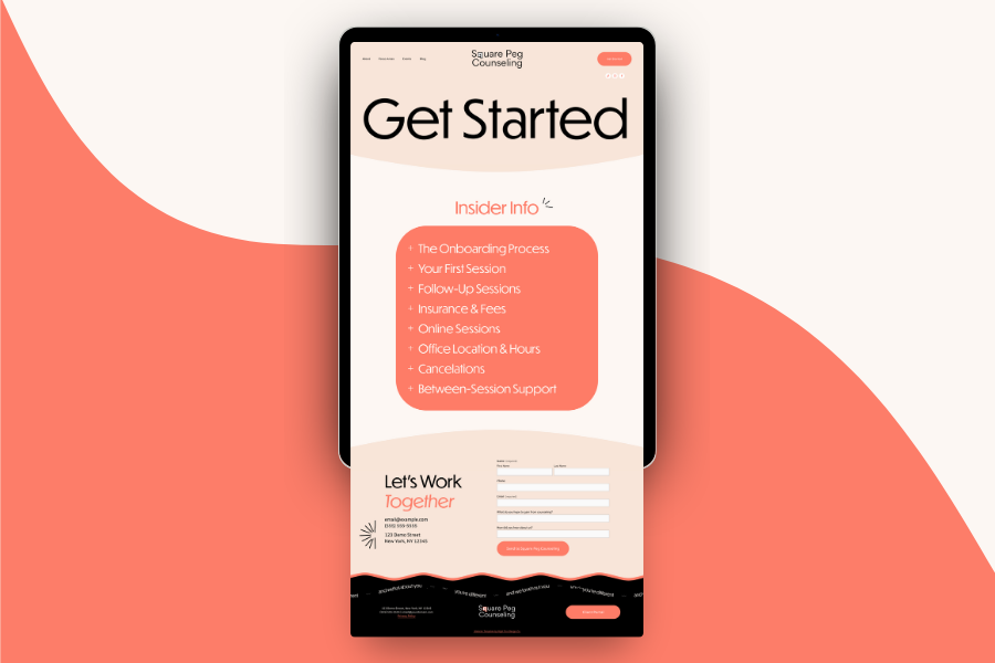
2. Missing Step-by-Step Instructions
A booking link is not a process. An email address is not a process. Your site should clearly spell out what to do:
Schedule a free consultation.
Chat via phone to see if we’re a good fit.
Book your first session.
Without that, clients are left to guess — and guessing is a conversion killer.
3. Buried or Poorly Placed Key Info
If your rates, insurance details, or “how it works” page are tucked away in a random FAQ that’s two menus deep, most people won’t find them. And if they can’t find them, they won’t reach out.

4. Too Many Choices
You might think you’re being flexible by offering email, phone, or a contact form. But without guidance on which one to use, you’re actually creating decision anxiety. Same goes for booking pages with a dozen service options — if you want them to start with a consultation, tell them that.
5. Disorganized Content Flow
Your in-person vs. online options are in one spot, your location is buried somewhere else, and your booking link lives on a third page. People shouldn’t have to piece together basic logistics like a puzzle.
6. Missing Critical Details Entirely
If you only see women, are private pay only, or don’t work with certain issues, that needs to be obvious before someone contacts you. Otherwise, you’ll waste their time and yours.
7. Overwhelming Walls of Text
Sometimes the process is there — it’s just buried in 500 words of dense paragraphs. People don’t read websites like novels; they skim. If your instructions are long-winded, they’ll miss them completely.
8. The “Where Am I Supposed to Click?” Problem
If your “Book Now” button is hiding in your footer or competing with five other calls-to-action, it’s easy to miss. Your primary button should stand out visually and repeat consistently.

9. Outdated or Broken Links
Nothing says “I’m not taking clients” like a broken booking link or an online scheduler that shows no availability. If you’ve changed your services or hours, your booking page needs to reflect that — immediately.
10. Asking for Too Much, Too Soon
Throwing intake paperwork, consent forms, and payment agreements at someone before they’ve even had a consultation is overwhelming. At the inquiry stage, keep it light and simple.
11. Step-Order Confusion
Telling someone to “Book a Session” before they’ve seen your rates or insurance info might make sense to you, but to a potential client, it’s like asking them to check out without knowing the price.
12. Over-Explaining the Wrong Thing
You don’t need to spend 800 words talking about therapy. If they’re on your site, they are ready to start — they need to know how.
How to Fix Your Website’s Client Path
You don’t need a full site redesign to fix this — but you do need to get intentional.
Audit your own site like a stranger. Start at the homepage and try to “become a client.” Is it obvious where to click? Do you hit roadblocks?
Reduce steps. Aim for no more than 2–3 actions from interest to inquiry.
Guide them clearly. Use both text and design to show the way. Headlines like “Here’s How to Get Started” go a long way.
Make critical info obvious. Rates, process, and location should never be hidden.
Test on mobile. Your main CTA should be visible on the first swipe.
Bottom Line
If your therapy website isn’t converting visitors into clients, don’t immediately assume it’s your SEO, your fees, or your copy. Often, it’s simply that the people who want to work with you can’t figure out how to get started.
Make it clear. Make it simple. Make it feel easy.
And watch what happens.

Pin it!


Some of My Favorite Private Practice Tools
Resources and Referral Links