How to Make Your DIY Website Look Less DIY
This article explains how to make your DIY website look less DIY with simple, high-impact design improvements any therapist or coach can apply. Learn how to create consistency across your pages, balance color, improve readability, remove visual clutter, unify your images, clean up your navigation, refine typography, and optimize your site for mobile. You will also find easy design upgrades that instantly make your site feel more professional and polished, plus options for templates and custom one-day website builds if you want a designer-quality site without doing it alone.

How to Make Your DIY Website Look Less DIY
You can spot a DIY website from a mile away. Crooked spacing. Clashing fonts. Buttons that look like they came from different sets. A navigation menu packed like a Costco cart the day before Thanksgiving.
The good news: Most of the issues that make a website look DIY are easy to fix. You do not need to be a designer. You do not need new tools. A polished, professional-looking site is more about consistency, clarity, and a few foundational design habits than anything else.
Here are my favorite ways to make your DIY website look clean and designer. These apply to any site platform, but if you are a therapist using Squarespace, you can do all of these with a few small adjustments.
Let’s make your website look less homemade and more “I hired someone for this.”

01. Consistency is the number one rule
If you only change one thing, change this. Consistency is the secret ingredient behind every professional website. When your margins, fonts, colors, buttons, icons, layouts, and image treatments match across pages, the entire site instantly looks more expensive.
Scan your pages and check for:
headers different sizes across pages
buttons using different colors or shapes
text blocks stretching wider on some pages than others
margins that vary section to section
images cropped square in one place and rounded in another
Pick your style.
Rounded or square.
Borders or no borders.
Shadow or flat.
Then use that same style everywhere. When everything looks like it belongs to the same family, your website feels intentional. Not chaotic. Not DIY.
02. Balance how you use color
You can go bold. You can go moody. You can go monochrome. The issue is not color. The issue is unbalanced color. If one section is drenched in a shade that never shows up again or a random colored graphic is competing for attention, it creates visual noise.
Try this simple trick. Take a screenshot of an entire page on your website so you can see your site zoomed out. Ask yourself if the color appears evenly across the page or if it pools in random corners. Balanced color feels clean and professional. Unbalanced color feels accidental.

03. Make everything easier to read
Readability is one of the fastest ways to elevate your site. Your content should be skimmable. Your eyes should not have to work. Good readability does more for professionalism than fancy animations or pretty fonts.
Use these guidelines.
break text into sections
avoid full-width paragraphs
add generous spacing around your text
choose highly legible fonts
check contrast
keep line lengths short and comfortable
Don’t center justify more than two lines of text
When your site is easy to read, people stay longer. They feel grounded.

Too much clutter!
04. Remove the clutter
Clutter is one of the most common DIY mistakes. Designers use restraint. DIY sites often try to fill every inch of space.
Clutter looks like:
too much content in a single section
small margins that make everything look squished
overusing bold or italics to force emphasis
banner images so busy the text gets lost
graphics sprinkled everywhere without a clear purpose
a navigation menu with every thought you ever had
Your website will look cleaner if you remove what you do not need. Let empty space exist. Your content will breathe. Your design will look intentional.

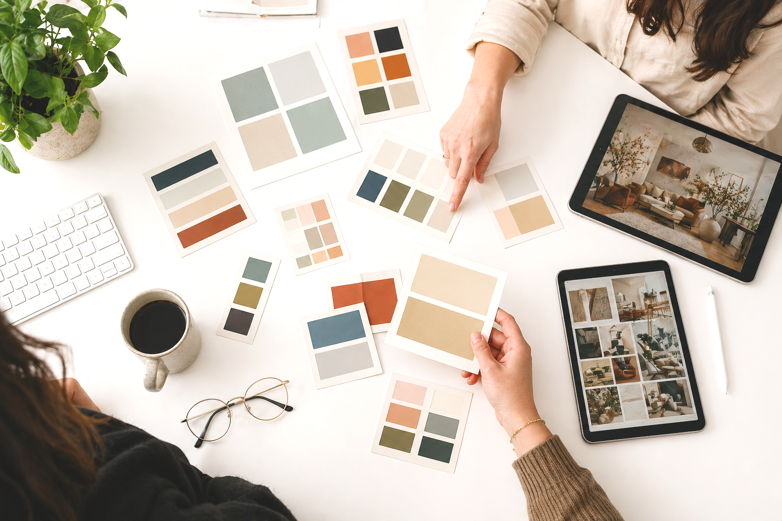
05. Make your stock images feel unified
Stock images are not the problem. Inconsistent stock images are the problem. When one image is bright and airy, one is dark and moody, and one looks like a J. Crew catalog, the site loses cohesion.
Ways to fix this.
choose images within the same color family
apply the same filter across all photos
choose one vibe and stick with it
keep image formatting consistent
Consistency in imagery goes a long way in making the entire site feel professional.
06. Keep everything functional and smooth
Nothing screams DIY like glitchy animations, mismatched widgets, or layout issues on mobile. Your site should feel smooth and calm, not jittery and unpredictable.
Check for:
broken links
animations that stutter
overlapping content on mobile
third party widgets that do not match your brand
Content shifting out of place on smaller screens
If something feels off, simplify. You will never regret removing a feature that adds chaos.
07. Use clear visual hierarchy
DIY websites often fall apart in the typography. Headings jump around with no rhythm and body text changes size for no reason.
Visual hierarchy tells your visitors what to pay attention to first. Without it, everything blends together and your pages feel flat.
Set a simple structure.
one H1 size (40 to 48 px)
one H2 size (28 to 32 px)
one H3 size (20 to 22 px)
one body text size (16 to 18 px)
Keep this consistent across your site. Designers use predictable patterns because they make content easier to follow. You can do the same.
08. Pick one or two signature design elements and repeat them
A signature element gives your site personality without overwhelming it. It also makes your design look consistent across pages.
For example.
using rounded image corners everywhere
using the same thin line divider
repeating the style of the first section on every page
using the same background color for all call-to-action sections
Your site will feel more polished when you repeat an element on every page.

09. Tidy up your navigation
Your navigation is one of the first things people judge. A clean nav feels professional. A cluttered one gives away your DIY status.
Do these three things.
keep it short and clear
use consistent spacing
avoid long page names
If your navigation looks good, the entire site gains credibility.
10. Use intentional microcopy
Microcopy is the tiny text around your site that guides your user. These little details add personality and polish.
Examples:
Instead of “Submit,” try “Book your session.”
Instead of “Learn more,” try “See the details.”
Instead of “Contact,” try “Get in touch.”
These small touches make your site feel more human and less generic.
11. Do not skip your footer
A messy footer feels unprofessional. A clean footer anchors your entire brand.
Add:
your logo or name
simple navigation
contact details
social links
legal pages
Keep it spacious and tidy. Treat it as an extension of your brand, not an afterthought.

12. Make your mobile site shine
Most DIY sites look fine on desktop and chaotic on mobile. Your mobile site should feel as good as your desktop site.
Check for:
text that is too big or too small
buttons too small to tap
images spilling over edges
sections stacked out of order
spacing that feels tight
Your mobile visitors notice when things feel off. A clean mobile design makes your whole site look professional.

Ready for the easiest way to make your DIY site look less DIY?
If you want your site to feel professional without spending months tweaking it, I have two options that make this simple.
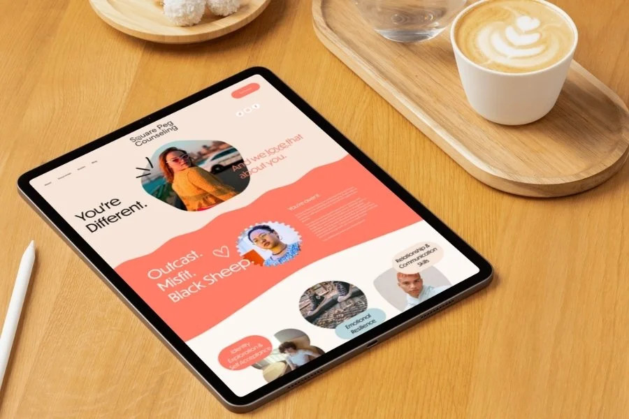
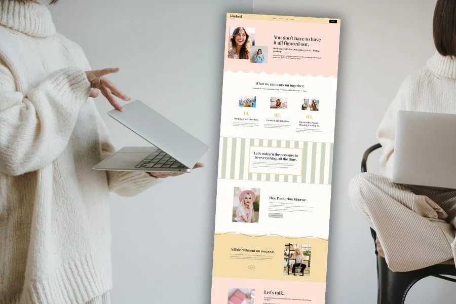
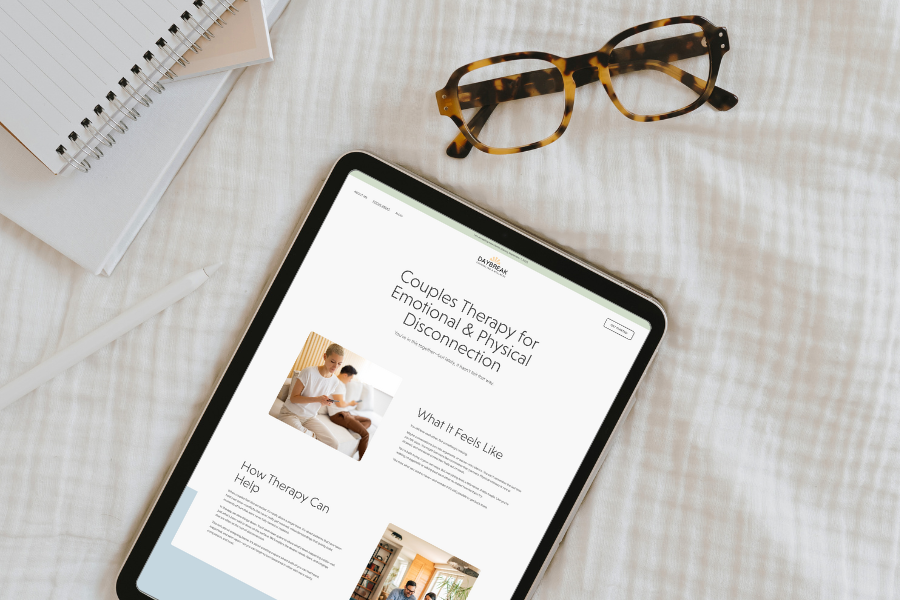
1. High Five Design Co. Templates
If you want a site that feels custom without the custom price, my templates are built for you. They are modern, polished, therapist friendly, SEO ready, and designed to guide your ideal clients to take action. You customize the words and images. I have already done the design work for you.
2. A Custom One-Day Website
If you want to hand me your ideas and walk away with a fully built, strategic, beautiful website by the end of the day, this is the service therapists love most. You get a brand-aligned site that elevates your practice, clarifies your niche, and feels completely like you.
Pin it!


Some of My Favorite Private Practice Tools
Resources and Referral Links