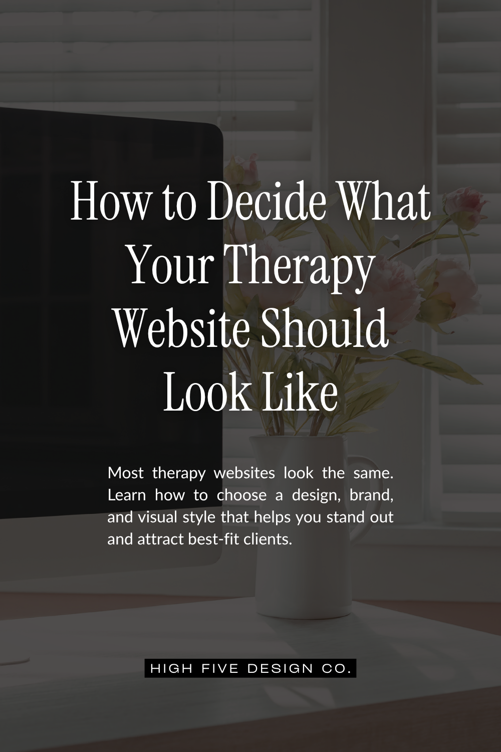
How to Decide What Your Therapy Website Should Look Like

How to Decide What Your Therapy Website Should Look Like
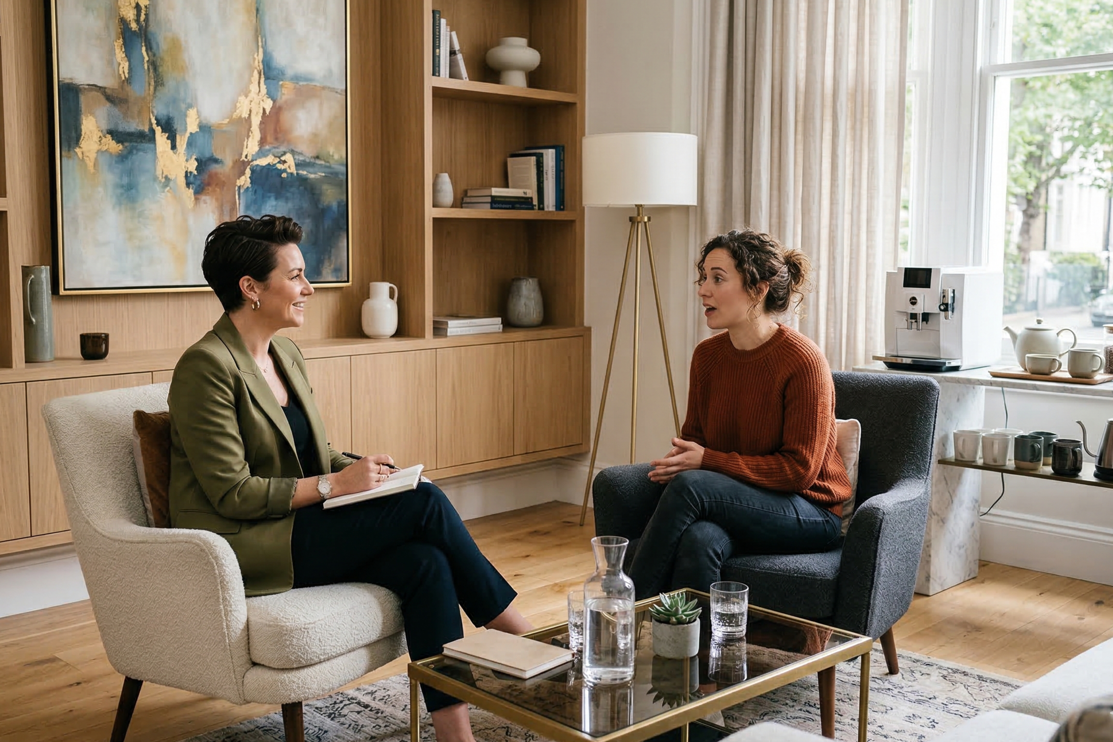
Your therapy website does not need to look like every other therapy website on the internet. In fact, if your practice is struggling to stand out, it probably shouldn’t.
A lot of therapists end up with websites that feel clean, calm, neutral, and perfectly acceptable. Which sounds fine until you remember that “perfectly acceptable” is not usually what makes someone stop scrolling, read your words, and think, “Oh. This person might actually get me.”
The visual design of your website matters. Your colors, fonts, layout, imagery, graphics, movement, and overall vibe are all communicating before anyone reads a single paragraph of your carefully written copy. Your website is already saying something about who you are, how you work, and what kind of experience a client might have with you.
The real question is whether it is saying that on purpose.
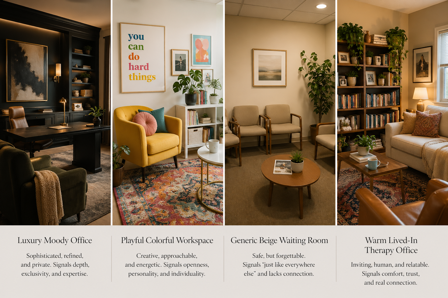
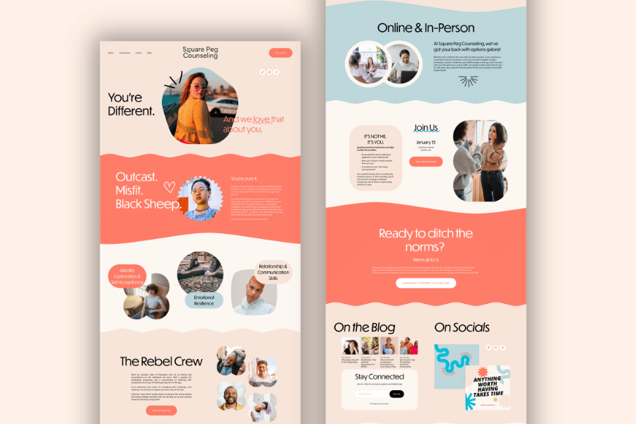
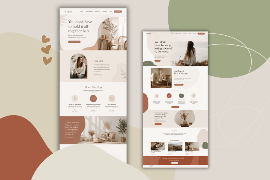
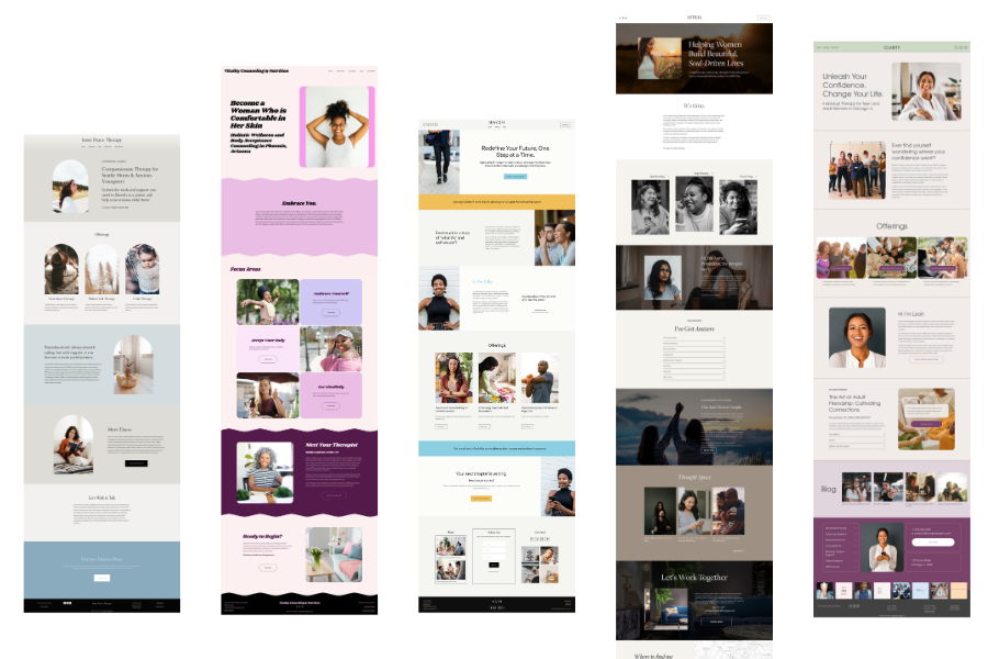
These are all professional. They do not say the same thing.
Your Website Already Has a Personality
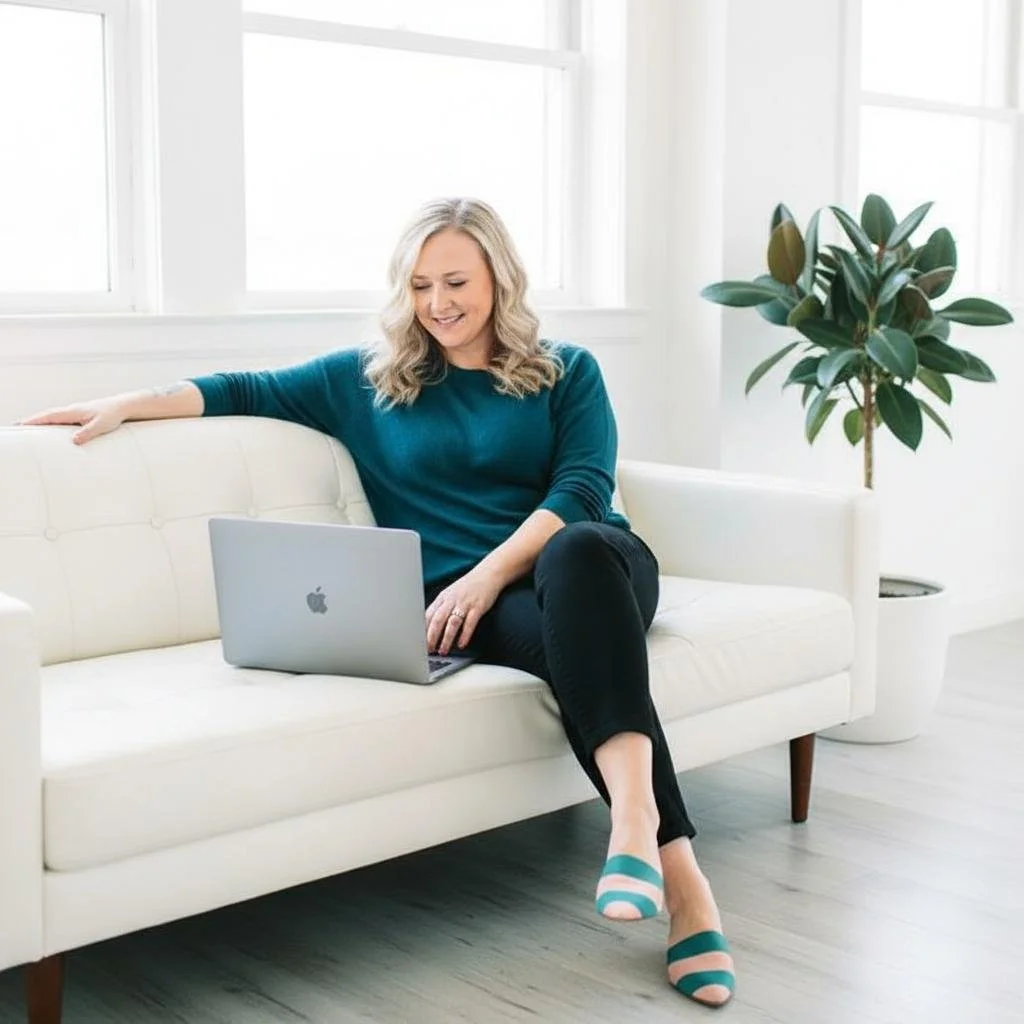
A lot of therapists think they are choosing a “neutral” design when they pick soft colors, white space, simple fonts, and a serene photo of a plant living its best emotionally regulated life. But neutral is not actually neutral. Minimalist design has a personality. Beige has a personality. A script font has a personality. A giant photo of ocean waves has a personality. Unfortunately, sometimes that personality is “I panicked and chose the least offensive option.”
That does not mean calm, clean, or minimalist websites are bad. They can be beautiful, strategic, and highly effective when they match the therapist, the client, and the work. But when every therapist nearby rocks a soft sage website, a fern portrait, and a headline about healing, your impeccably tasteful site risks blending into the world’s most serene game of hide-and-seek.
Your website’s visual identity should help people understand what kind of therapy experience you offer. Are you warm and grounding? Direct and insight-oriented? Creative and relational? Sophisticated and depth-focused? Practical and structured? Funny and human? Your design can support those impressions before your copy has to do all the heavy lifting.
Stop Designing Only for “Calm”
Therapists often default to a calm, serene brand because they assume that is what clients want. And yes, many therapy clients do want to feel calmer. That is not wrong. But calm is often the destination, not the starting point.
Most people are not searching for a therapist while lounging peacefully under a weighted blanket, sipping herbal tea, and feeling deeply connected to their inner wisdom. They are searching because something is not working. They may be overwhelmed, resentful, grieving, anxious, burned out, ashamed, disconnected, stuck in the same argument for the 900th time, or quietly Googling therapists between meetings while pretending to be a functioning adult.
So instead of asking, “What colors feel calming?” ask, “What does my ideal client need to feel in the first few seconds on my site?”
They might need to feel:
Understood
A client who feels alone in their experience may need your site to communicate, “You are not the only one who feels this way, and there is a thoughtful way through it.”
Grounded
A client in crisis or transition may need design that feels steady, contained, and clear. This does not automatically mean beige. It means the site should not feel chaotic, flimsy, or like it was assembled on a day you had one too many cups of coffee.
Challenged in a Good Way
Some clients are not looking for a purely soothing presence. They want someone who can help them see patterns, tell the truth kindly, and stop circling the same drain. A more confident, structured, or editorial visual style may speak to them better than something soft and misty.
Hopeful
Hope does not have to look like a sunrise photo with a handwritten font. It can look like movement, color, clarity, warmth, or a sense that life can get bigger again.
Relieved
Sometimes the best website feeling is not “peaceful.” It is “Oh thank God, this person works with exactly this.”
Clients may want peace, but they often arrive in the middle of real life.
Design for Your Best-Fit Client, Not the Imaginary Internet Committee
One of the fastest ways to water down a therapy website is to design it for a vague, imaginary group of people who may or may not approve. This committee includes potential clients, other therapists, your old supervisor, your cousin who once took a branding class, and a stranger on Instagram who obsesses over fonts.
Your website does not need to impress everyone. It needs to resonate with the clients you are best equipped to help.
If your ideal client is a high-achieving woman in midlife who looks competent on the outside but feels like she is held together by calendar alerts and resentment, your design choices should speak to her. If your ideal client is a couple who has read every communication book and still cannot get through a discussion about the dishwasher without summoning a courtroom drama, your site should speak to them. If your ideal client is a creative, neurodivergent adult who has always felt like traditional therapy spaces were too sterile or too vague, your site should not look like it was designed by a beige filing cabinet.
The more specific your practice, the more specific your visual choices can be. Specific does not mean gimmicky. It means intentional.
A Strong Brand Attracts and Repels
Therapists tend to be very comfortable with the idea of attraction and very uncomfortable with the idea of repulsion. Understandable. Most therapists did not go into this field because they love excluding people. But your brand should not invite every person into your practice equally.
A strong brand helps the right people feel more confident reaching out. It also helps the wrong people quietly move along without either of you having to find out three sessions in.
This is not about being harsh. It is about clarity. A deeply gentle, spacious, nurturing site may be perfect for one therapist and completely wrong for another. A bold, witty, direct site may thrill one client and make another client decide, “Absolutely not.” Good. That is information. We love information. We do not always love receiving it, but it is still useful.
If your site feels like it could belong to any therapist, it is probably not working hard enough for you.
Every visual style sends a signal. Some are just more useful than others.
How to Translate Your Client Into Design Choices
Here is a simple way to think about your visual brand without spiraling into 47 Pinterest boards titled “vibe maybe???”
1. Start With the Client’s Inner Experience
Before you choose colors or fonts, describe your ideal client in plain language. Not just “women ages 30 to 55.” Go deeper. What is happening in their life? What are they tired of? What do they secretly worry is true about them? What do they want to feel more capable of doing?
For example, your client might be:
A high-functioning professional who is exhausted from being reliable.
A midlife woman questioning everything she built her life around.
A couple who loves each other but keeps getting trapped in the same painful loop.
A young adult who feels behind, overwhelmed, and allergic to being told to “just make a plan.”
A parent who is touched out, overextended, and quietly furious that everyone still needs dinner.
Once you can describe the client clearly, you can begin to make better visual decisions.
2. Identify the Feeling They Need From You
Next, ask what emotional experience your website should create. Do they need groundedness? Permission? Clarity? Depth? Warmth? Momentum? A sense of possibility? A sense that you will not be shocked by their mess?
This feeling becomes the bridge between your clinical work and your visual brand.
Possible Feelings Your Website Might Need to Create
As you read through this, notice what stands out. You’re not trying to pick ten. You’re looking for a small handful that feel very true to your work and your clients.
Your website might need to help your ideal client feel:
Understood
Seen without having to over-explain
Relieved that someone finally “gets it”
Less alone in what they’re experiencing
Calmer, or at least less activated
Grounded
Contained, like things won’t spiral here
Safe enough to be honest
Not judged, even for the messy parts
Gently challenged in a way that feels respectful
Clearer about what’s actually going on
Hopeful that change is possible
Curious about themselves instead of critical
Less stuck, or like movement is possible
More in control of their decisions
Less overwhelmed by options or information
Oriented, like they know where to start
Reassured that there is a process
Confident in your competence
Trusting that you know what you’re doing
Invited, rather than sold to
Comfortable enough to reach out
Less intimidated by therapy
Less intimidated by you
More open to the idea of doing deeper work
More willing to look at things they’ve been avoiding
Encouraged to take themselves seriously
Validated in their experience
Less ashamed of what they’re struggling with
More compassionate toward themselves
Like they won’t be reduced to a label
Like they won’t be rushed
Motivated to make a change
Gently nudged forward
Energized or activated in a healthy way
Less resigned about their situation
More empowered to take action
Like growth is possible, even if it’s uncomfortable
Like therapy might be worth the effort
Like this could be different from past therapy experiences
Like they can finally stop searching
Turn That Feeling Into Design
Now you can begin translating strategy into visuals.
A client who needs a sense of stability may respond well to grounded colors, structured layouts, clear headings, and photography that feels real rather than overly aspirational.
A client who needs hope and momentum may respond to brighter accents, more movement, energetic layouts, and copy sections that feel clear and forward-moving.
A client who needs depth may connect with richer colors, editorial typography, layered imagery, thoughtful white space, and a site that feels sophisticated without becoming cold.
A client who needs warmth and accessibility may respond to natural textures, friendly fonts, rounded shapes, inviting photos, and layouts that feel easy to move through.
Design is not just decoration but a translation.
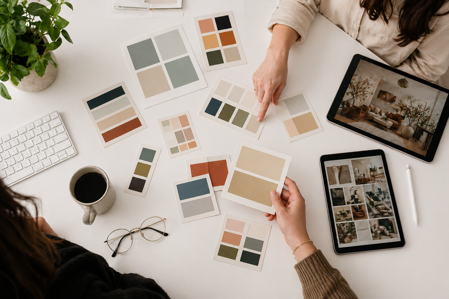
Color Is Not Just “What You Like”
Color is one of the fastest ways to create a feeling on your website, which is why choosing colors based only on personal preference can get tricky. You may personally love hot pink, oxblood, and electric orange. Wonderful. I support your inner maximalist. But if your ideal client is looking for perinatal grief counseling, we may need to have a conversation.
Your brand colors should sit at the intersection of your personality, your work, your client’s emotional state, and the kind of experience you want to create.
Soft colors can feel gentle, reflective, and emotionally safe. They can also feel vague or overly familiar if they are not paired with strong messaging and intentional design.
Earthy colors can feel grounded, warm, and human. They can also look muddy or dated if the palette is not balanced.
Bright colors can feel energetic, hopeful, and distinctive. They can also feel overwhelming if everything is bright and nothing has hierarchy.
Dark colors can feel sophisticated, deep, and confident. They can also feel heavy if they are not softened with enough contrast, warmth, or space.
Neutrals can feel polished and timeless. They can also feel generic if the design lacks personality.
Don’t try to pick the “right” color universally. PIck colors that make sense for your practice.
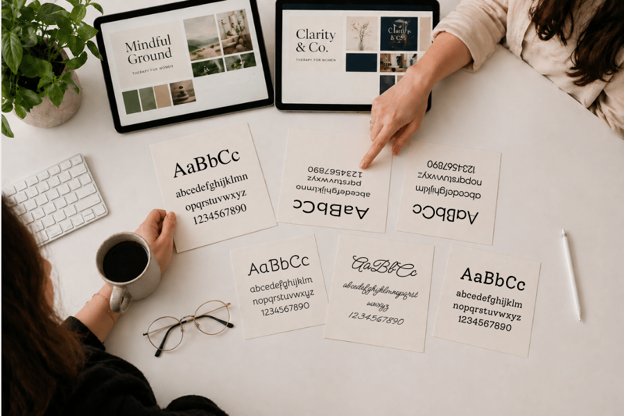
Fonts Have a Voice, Whether You Asked Them To or Not
Fonts are sneaky. People may not consciously notice them, but they absolutely feel them. A font can make your site feel elegant, clinical, playful, intellectual, warm, modern, traditional, expensive, approachable, or like you downloaded it during a moment of optimism in 2014.
Serif fonts often feel more traditional, editorial, literary, or refined. They can work beautifully for therapists who want a sense of depth, sophistication, or thoughtfulness.
Sans serif fonts often feel cleaner, more modern, more direct, or more accessible. They are useful when you want clarity, simplicity, and ease.
Rounded fonts can feel friendly and warm. Used well, they can soften a site. Used carelessly, they can make a professional practice feel like a children’s toothpaste brand.
Script fonts can feel personal, elegant, or soft, but they are easy to overuse and hard to read. A little script font can be charming. A lot of script font can feel like your website is whispering inspirational quotes from a throw pillow.
The key is pairing fonts with intention. Your heading font can carry more personality, while your paragraph font should be easy to read. Therapy websites often have a lot of emotionally important information, and nobody should have to squint their way through your cancellation policy because the font is “pretty.”
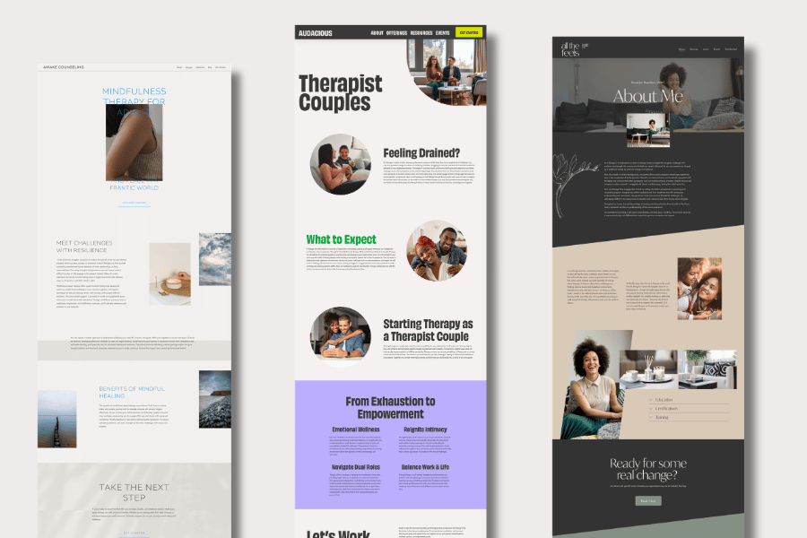
Layout Is How You Guide the Brain
Layout does more than place elements on a page; it guides visitors to what’s important, directs their gaze, and signals how much effort they’ll need to invest. A spacious layout can feel calm, premium, and reflective. But if there is too much space and not enough substance, the site can feel empty or vague.
A structured layout can feel clear, grounded, and trustworthy. It helps people understand your services quickly and move through the site without getting lost.
An editorial layout can feel sophisticated, distinctive, and more memorable. It can be especially useful for therapists whose work has depth, nuance, or a strong point of view.
A playful or layered layout can feel creative and alive. It can help a practice stand out, especially when the therapist works with clients who appreciate personality and flexibility.
A cluttered layout, however, is usually just cluttered. There is no clinical reframe needed.
When someone lands on your site, their brain is asking simple questions: Where am I? Is this for me? What do I do next? Can I trust this person? Your layout should help answer those questions quickly.
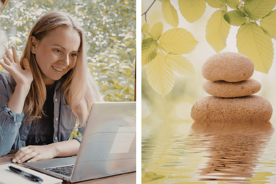
Imagery Should Feel Like Your Client’s World, Not a Wellness Brochure
Therapy stock photos can get weird very quickly. You know the ones. A woman in a field touching tall grass. A person sitting alone on a dock. A couple holding mugs and laughing with the intensity of people who have never discussed finances. A stack of stones, bravely stacked.
Images matter because they help clients decide whether your site feels real. The best images are not always the most beautiful. They are the ones that feel emotionally accurate.
If your ideal client is burned out, polished stock photos of a woman journaling peacefully at sunrise may not connect. She may be thinking, “Great, even this fictional woman has a morning routine.” A more grounded image, like a lived-in desk, a thoughtful portrait, or a warm interior with texture, may feel more honest.
If you work with couples, avoid imagery that makes relationships look like a toothpaste commercial. Couples therapy clients are usually not searching because they need more photos of people laughing into salad. They are searching because they are stuck, lonely, angry, worried, or trying to find their way back to each other.
Your imagery should create recognition, not fantasy.
Graphics, Icons, and Decorative Elements Should Do Something
Graphics can make a therapy website feel more distinctive, especially when they are used to support the brand instead of just decorating empty space. Abstract shapes, line drawings, subtle patterns, hand-drawn elements, texture, collage, or icons can all help create a visual language.
The danger is adding graphics just because the page feels boring. That is how websites end up with random blobs. The blob era had its moment, and it served bravely, but we do not need to keep asking blobs to carry our entire brand identity.
Good graphic elements should support the mood of the site. Organic shapes can feel warm and human. Geometric lines can feel structured and thoughtful. Hand-drawn details can feel personal and creative. Subtle texture can make a site feel less sterile. Icons can help organize information, but they should match the overall style. A delicate line icon, a chunky cartoon icon, and a corporate tech icon all say different things.
Small details add up. They are not the strategy by themselves, but they can reinforce the strategy beautifully.
Animation Can Add Polish, But Please Use Restraint
Animation can make a website feel more modern, dynamic, and polished. A soft fade, a gentle reveal, or a subtle hover effect can create a sense of movement and care. It can help the site feel alive.
Too much animation, however, can make a therapy website feel like it is trying to win a middle school PowerPoint competition. If every section slides, bounces, spins, floats, and appears dramatically from the left, your visitor may forget they came for therapy and start looking for the “skip intro” button.
For therapy websites, animation should usually be subtle. It should support the experience, not distract from it. Your ideal client is likely already carrying enough mental noise. Your website does not need to join in.
Trends Are Not a Strategy
It is completely normal to be influenced by design trends. We all live in the same visual culture. If enough websites start using giant serif headlines, muted clay colors, and asymmetrical layouts, eventually everyone starts wondering if maybe they too need a giant serif headline and a tasteful blob of terracotta.
Trends are not inherently bad. Some trends are useful because they reflect broader shifts in what feels modern, readable, or visually engaging. But a trend should never be the whole strategy.
Your ideal client is not sitting at home thinking, “I hope this therapist has a very current font pairing.” They are wondering whether you understand what they are going through. They are wondering whether therapy with you will help. They are wondering whether they can imagine telling you the thing they have barely admitted to themselves.
If a trend helps create the right emotional experience, use it. If it is just trendy, pause before giving your whole practice the visual identity of whatever is currently popular on design Instagram.
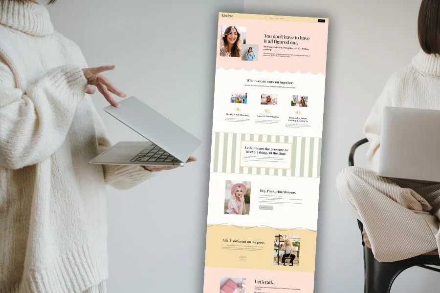
Your Website Design Should Be Chosen Strategically
When choosing a website template, it is tempting to pick the one you personally like best. That matters, of course. You should not choose a template that makes you feel dead inside. But your favorite design is not automatically the best design for your practice.
A better question is, “Which template creates the clearest bridge between my personality, my services, and the clients I want to reach?”
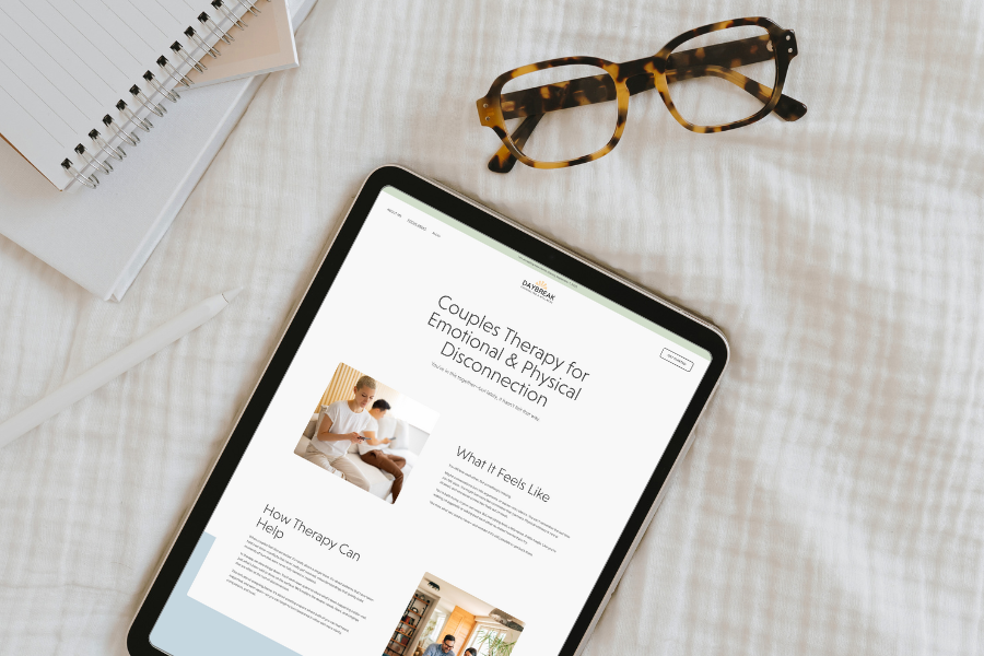
For example, a warm, grounded template may work beautifully for a therapist who helps clients through burnout, life transitions, grief, or relational stress. It can communicate steadiness and humanity without feeling sterile.
A bold, editorial template may be a better fit for a therapist whose work is insight-oriented, direct, specialized, or designed for clients who want depth and clarity. It can help the practice feel more distinctive and confident.
A softer, spacious template may be right for a therapist who works with clients who need emotional safety, gentleness, and room to breathe. But it still needs strong copy and clear structure so the site does not drift into “lovely but unclear.”
A more creative or colorful template may be perfect for therapists who work with creatives, neurodivergent clients, teens, young adults, or people who are tired of clinical spaces that feel overly sanitized.
None of these directions are universally better. They are different tools for different practices.
Same Therapist, Different Brand
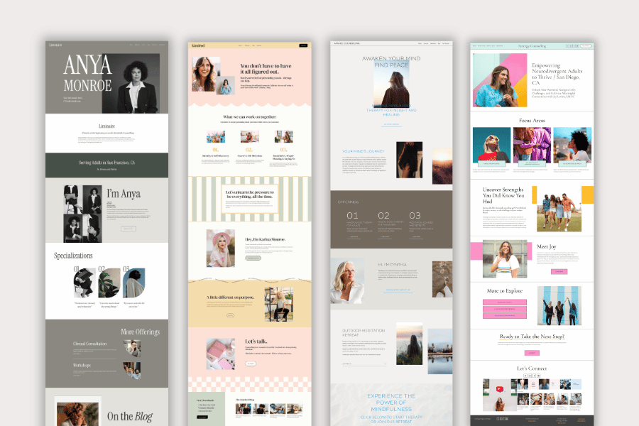
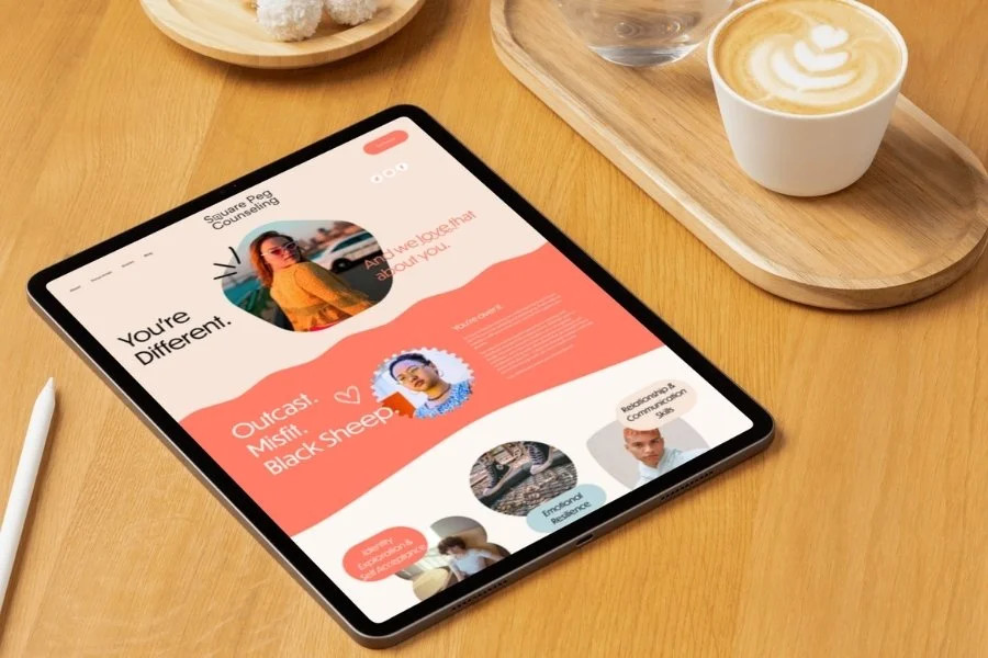
One of the easiest ways to understand visual strategy is to imagine the same therapist with three different websites.
Let’s say the therapist works with high-achieving women who are burned out, over-functioning, and quietly wondering why their very impressive life feels so draining.
A soft, serene brand with pale colors, gentle fonts, and airy imagery might communicate, “This is a calming space where you can finally exhale.” That could work well if the therapist’s style is gentle, reflective, and spacious.
A bold, editorial brand with strong typography, richer colors, and more direct layouts might communicate, “This is where smart, exhausted women come to tell the truth and make real changes.” That could work well if the therapist is warm but direct, insight-oriented, and comfortable naming patterns clearly.
A warm, structured brand with earthy colors, approachable fonts, and clear sections might communicate, “This is a grounded place to sort through the overwhelm and rebuild your life in a way that actually fits.” That could work well if the therapist balances depth with practicality.
Same niche. Same therapist. Same services. Completely different emotional signals.
That is why visual design matters. It shapes expectations before the client reads the details.
The Little Details Are Not Little
Many therapists focus on the big choices, like colors and homepage photos, but the smaller details often determine whether the site feels cohesive or amateur.
Button style matters. A sharp, square button feels different from a soft, rounded button. “Book Now” feels different from “Schedule a Consultation.” “Let’s Talk” feels different from “Get Started.” None of these are automatically right or wrong, but they are not interchangeable.
Spacing matters. Tight spacing can feel intense or cluttered. Generous spacing can feel calm and premium. Too much spacing can make the page feel disconnected.
Photo cropping matters. A tightly cropped portrait feels intimate and direct. A wider environmental photo feels contextual and spacious.
Icons matter. Thin line icons feel different from bold filled icons. Playful icons feel different from elegant icons. Random mixed icon styles feel like someone discovered a folder called “miscellaneous.”
Even your footer matters. A thoughtful footer can reinforce your location, services, and next step. A neglected footer can quietly whisper, “We gave up down here.”
Every detail contributes to the overall feeling of your site.
Professional Does Not Have to Mean Boring
Therapists sometimes worry that being visually bold will make them seem less credible. But professional does not have to mean bland. It means thoughtful, clear, ethical, and aligned.
A bold therapy website can still be professional. A colorful website can still be trustworthy. A playful website can still communicate depth. A sophisticated website can still feel warm. A minimalist website can still have personality.
It's not courage that's missing — it's consistency.
If your design choices are intentional, connected to your message, and easy for visitors to navigate, you have room to be much more interesting than you may think.
And honestly, many therapy websites could survive a small personality infusion. Nothing medically alarming. Just enough to confirm that a human being is involved.
A Quick Self-Check for Your Therapy Website’s Visual Brand
Before you redesign your whole website in a burst of clarity and mild avoidance, ask yourself these questions:
☑️ What does my current website feel like in the first five seconds?
Try to answer honestly. Not what you hope it feels like. What it actually feels like.
☑️ Could this website belong to almost any therapist?
If the answer is yes, your design may be too generic to support your positioning.
☑️ Does the visual style match my best-fit client’s emotional state?
Think about who they are when they arrive, not just who they hope to become.
☑️ Does my design match the way I actually work?
If your site feels soft and vague but your therapy style is direct, structured, and insight-oriented, there is a mismatch. If your site feels polished and corporate but your work is warm, relational, and deeply human, there is also a mismatch.
☑️ Are my visuals helping my copy or making it work too hard?
Good design makes your message easier to feel and understand. If your copy has to explain everything because the design communicates nothing, your site is underperforming.
☑️ Am I choosing this because it is strategic or because it feels safe?
Safe is understandable. Safe is often not memorable.
Your Website Can Be More Specific, and So Can You
A therapy website does not need to be loud to stand out. It does not need to be trendy, flashy, or wildly unconventional. But it does need to feel intentional.
Your colors, fonts, layout, images, graphics, and movement should all work together to tell the right people, “You are in the right place.” That message will look different depending on your practice. For some therapists, it will look calm and spacious. For others, it will look warm and grounded. For others, it will look bold, witty, sophisticated, creative, or refreshingly direct.
The aim isn’t to replicate the typical therapy website aesthetic. Instead, it’s to capture the experience of working with you and express it visually in a way your ideal clients immediately understand.
You are allowed to have a point of view. Your website is allowed to have one too.
And if your current site could be described as “nice, clean, and basically fine,” that may be the problem.
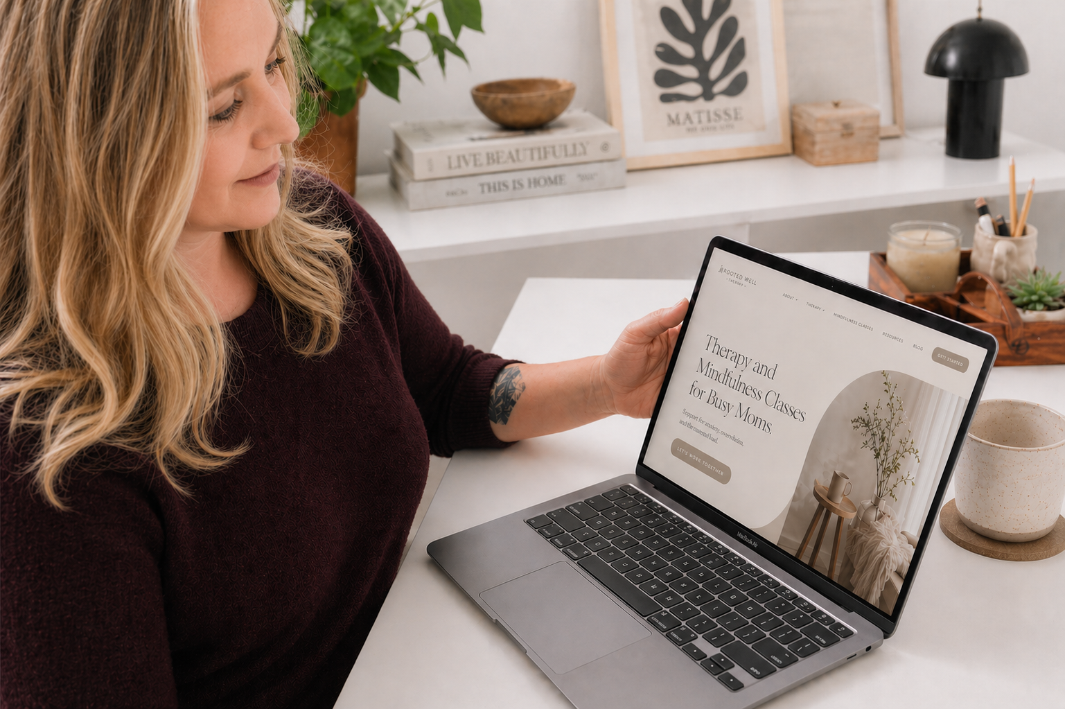
Ready for a Website That Actually Connects With the Right Clients?
If you’ve made it this far, you’re probably realizing something important:
Your website doesn’t just need to look good.
It needs to work.
And for most therapists, “working” doesn’t mean:
clean
calm
or generally pleasant
It means: the right people land on your site and think, “This is for me.”
If that’s not happening, your website is not doing its job.
My Custom One-Day Website is designed around exactly what this article walks you through:
Not just picking colors and fonts…
but making intentional decisions that connect with your ideal client.
In one focused day, we:
translate your client and your work into a clear visual direction
design a site that feels right to them, not just “nice”
build something distinct enough to stand out, but grounded enough to convert
Pin it!


Some of My Favorite Private Practice Tools
Resources and Referral Links