Make Your Therapy Website a Little Weirder (and Why That’s a Good Thing)

Make Your Therapy Website a Little Weirder (and Why That’s a Good Thing)
I follow a lot of interior design content. Probably more than is reasonable. And one thing I’ve noticed over the past few years is a big shift in what people are responding to.
The most admired homes are no longer the most polished ones.
They are not magazine-perfect or aggressively styled. They are designed, yes, but not overdesigned. They mix styles. They break a few rules. They include objects that feel personal, maybe even a little odd. And somehow, those homes feel more comfortable to be in. More human. More real.
Recently, House Beautiful published an article arguing that many homes today are not “weird” enough. The point was that when everything is too curated, too neutral, too safe, something essential gets lost. Personality disappears and the space stops reflecting the people who live there.
I see the same thing happening with therapist websites.
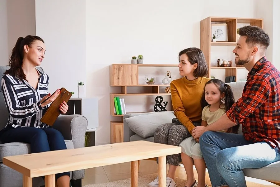
The Problem With Playing It Too Safe Online
Most therapist websites are not bad. In fact, many of them are objectively well done.
They use calming colors. They follow best practices. They say all the right things. They feel professional, grounded, and competent.
And they are completely forgettable.
In saturated markets, this is a real problem. When dozens of therapists are offering similar services, visitors are not carefully comparing credentials or reading every word of your About page. They are scanning. Feeling. Making quick, intuitive judgments.
When every site looks and feels the same, clients do not think, “These therapists are all equally good.” They think, “None of these stand out.”
Safety becomes invisibility.
What “Weird” Actually Means in This Context
When I say a website might need to be a little weirder, I am not talking about being edgy, loud, trendy, or confusing.
I am talking about unexpectedness.
Unexpectedness works when it feels grounded and intentional. It works when it communicates something about you that would otherwise be hard to say out loud. It works when it creates a pause. A moment of recognition. A sense that there is a real person behind the screen.
The homes people love most are not weird because they are chaotic. They are weird because they reflect taste, history, and preference. The same principle applies to websites.
Ways to Make Your Website More Unexpected (Without Losing the Plot)
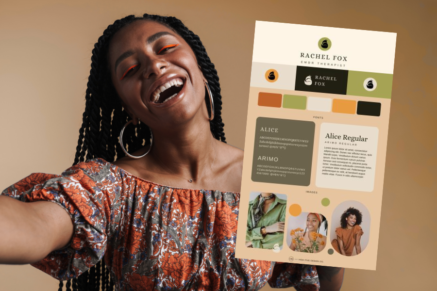
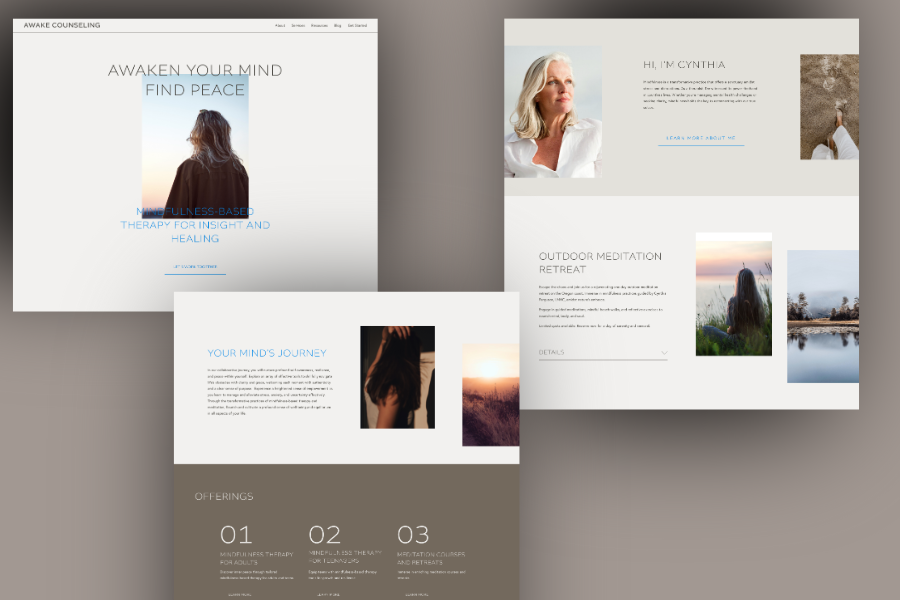
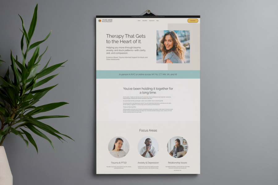
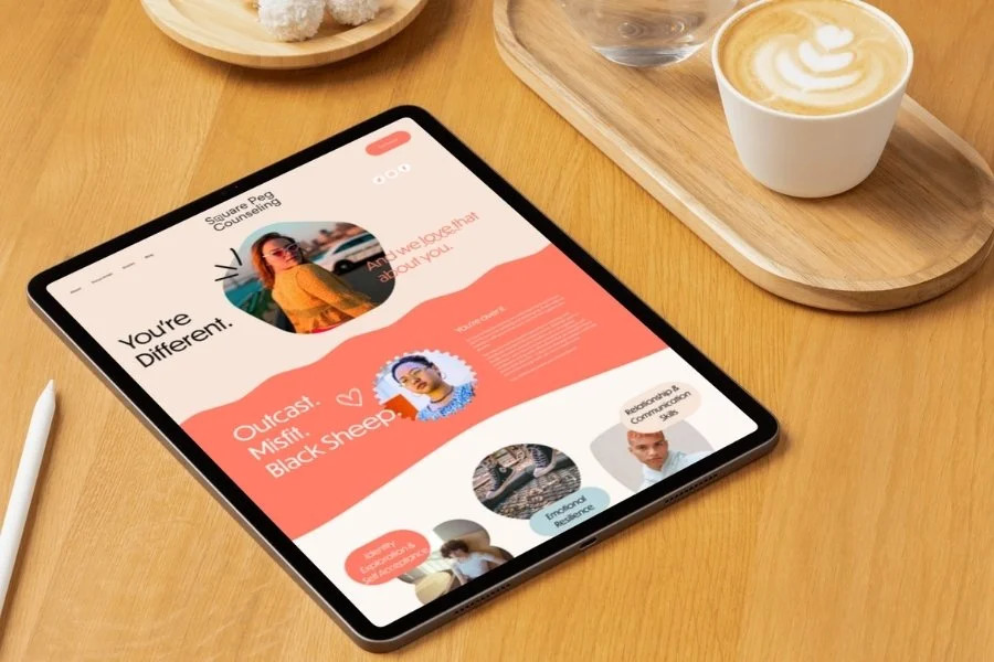
1. Use Color to Communicate, Not Just to Calm
Color is one of the fastest ways your website communicates meaning. Before a single word is read, your palette has already set an emotional tone.
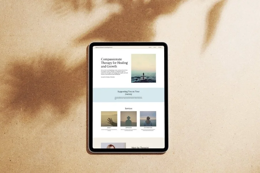
Many therapists default to the same cool, muted palettes because they feel safe and appropriate. But safe is not the same as accurate.
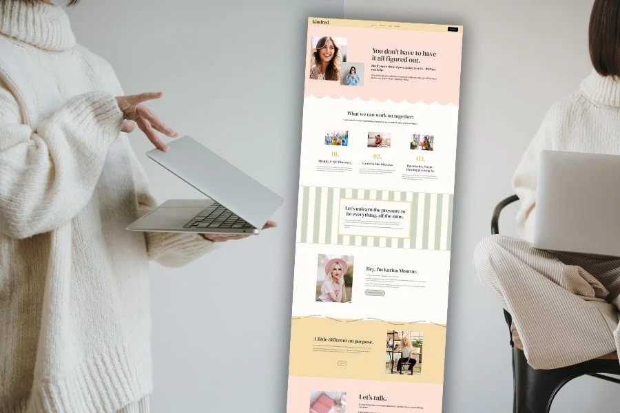
If you are a couples therapist who believes in repair, growth, and possibility, a palette that leans warm and optimistic quietly reinforces that belief. A sprinkle of coral or a bold blue can signal hope and forward movement without feeling overly cheerful or dismissive.
If you do trauma work and want to communicate safety and containment, that does not require sterile or clinical colors. Warm taupes, soft charcoals, grounded olives, and gentle earth tones can feel far more regulating than pale gray and stark white.
Unexpected color works when it aligns with the emotional experience of your work. It tells clients what it might feel like to sit with you.
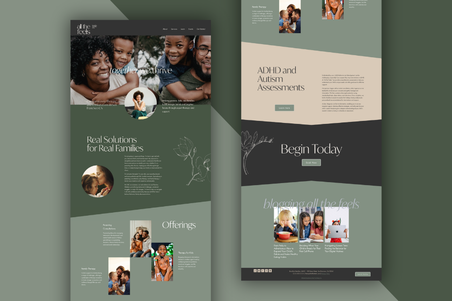
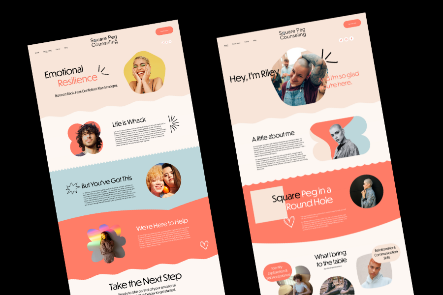
2. Use Layout to Signal Intention, Not Just Safety
Many therapists choose very predictable website layouts because they want to do the “right” thing. Then these layouts are often executed inconsistently. Margins shift. Images vary wildly in size. Spacing feels accidental. What was meant to look professional ends up looking uncertain.
An unexpected layout can actually feel more trustworthy when it’s done well. The key is intention.
Choose one defining structural idea and commit to it. Maybe that’s generous spacing, a text-forward layout, or a slightly asymmetrical look. Then support that choice with consistency. Use the same margins throughout. Keep image sizes uniform. Let repetition do the work.
Unexpected layout works when it follows its own rules. When the structure feels deliberate, visitors don’t experience it as risky. They experience it as confident. That sense of intention is what people respond to.That sense of intention matters.
3. Say the Thing Most Sites Avoid Saying
In an effort to sound professional and reassuring, many therapist websites rely on familiar phrases and careful wording. Over time, that sameness makes it harder for clients to feel what’s actually different about the work.
Unexpected messaging often means naming something clients already feel but rarely see reflected. It might be acknowledging ambivalence about therapy. It might be naming how hard change actually is. It might be admitting that insight alone is not always enough.
When language feels real instead of polished, clients feel recognized. That recognition creates trust much faster than perfect phrasing ever could.
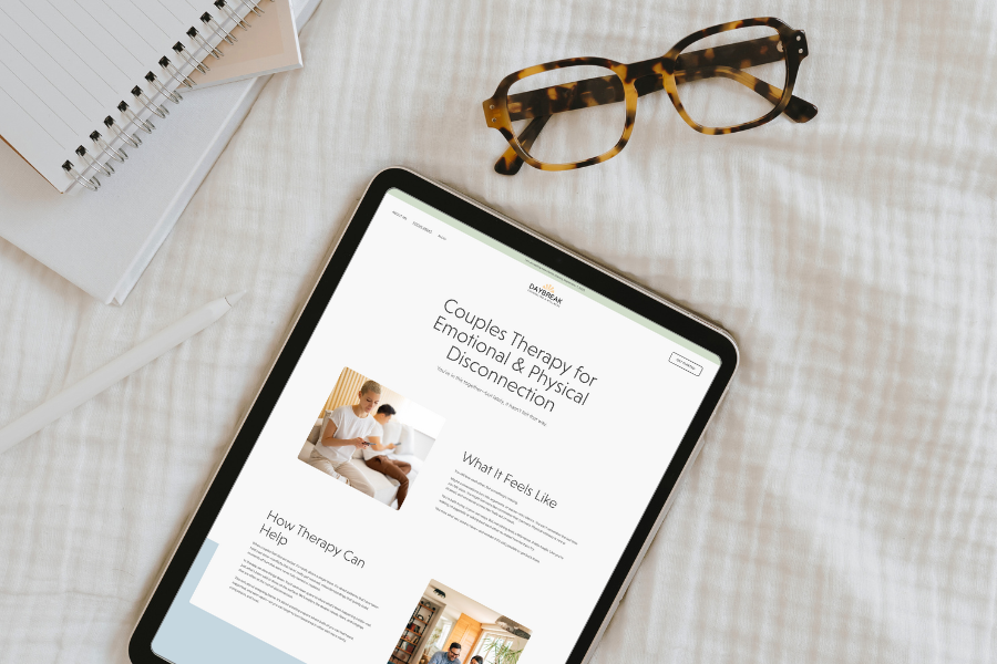
4. Use Constraint as a Design Choice
One of the more unexpected things you can do on a website is intentionally offer less. Many therapist sites are built from a genuine desire to be helpful, which often leads to listing every service, population, and modality in one place. The intention is generous, but the result can feel scattered and overwhelming.
When everything is presented as equally important, nothing stands out. Visitors are left trying to figure out where to focus, and many will simply leave rather than sort through too many options.
Constraint communicates something different. A shorter list of services, fewer navigation choices, or a clearer next step signals that you know what you do best and who you do it for.
This doesn’t mean hiding information. It means structuring the site so the primary path is obvious. When there are fewer competing calls to action, people are more likely to take the one that’s there. In an online environment where most visitors are already overwhelmed, restraint often feels calm, thoughtful, and easier to trust.
Why This Works, Especially in Saturated Markets
People remember what feels different, not what feels familiar.
Unexpected design elements create contrast, and contrast creates memory. When something deviates slightly from expectation, the brain pays attention. When it aligns with meaning and emotion, it sticks.
For therapists, this matters deeply. Clients are not choosing based on design alone, but design plays a powerful supporting role. It communicates tone, values, and perspective long before a consultation is booked.
A website that feels intentional and distinctive suggests that the therapy experience itself may be thoughtful, nuanced, and personal.
A Necessary Reality Check: Some Rules Are Not Meant to Be Broken
This is important.
Being unexpected does not mean sacrificing clarity, accessibility, or usability. Some elements are foundational and should remain solid.
Navigation should be obvious.
Fonts should be readable.
Contrast should support accessibility.
Pages should load quickly.
SEO basics still matter.
Clients should always know what to do next.
We are being intentional to communicate meaning. If a creative choice makes your site harder to use or understand, it is not serving you or your clients.
The Goal Is Presence, Not Perfection
The most effective therapist websites rarely feel polished in a performative way. Instead, they tend to feel more like well-lived-in spaces. There is a sense that someone thoughtful made decisions, chose what to include, and allowed the site to reflect something real rather than trying to meet every possible expectation.
These websites are not trying to impress everyone who lands on them. They are designed to resonate with the people who are most likely to feel understood by the work being offered. That difference matters. When a site is built to appeal to everyone, it often loses the specific signals that help the right clients recognize themselves in it.
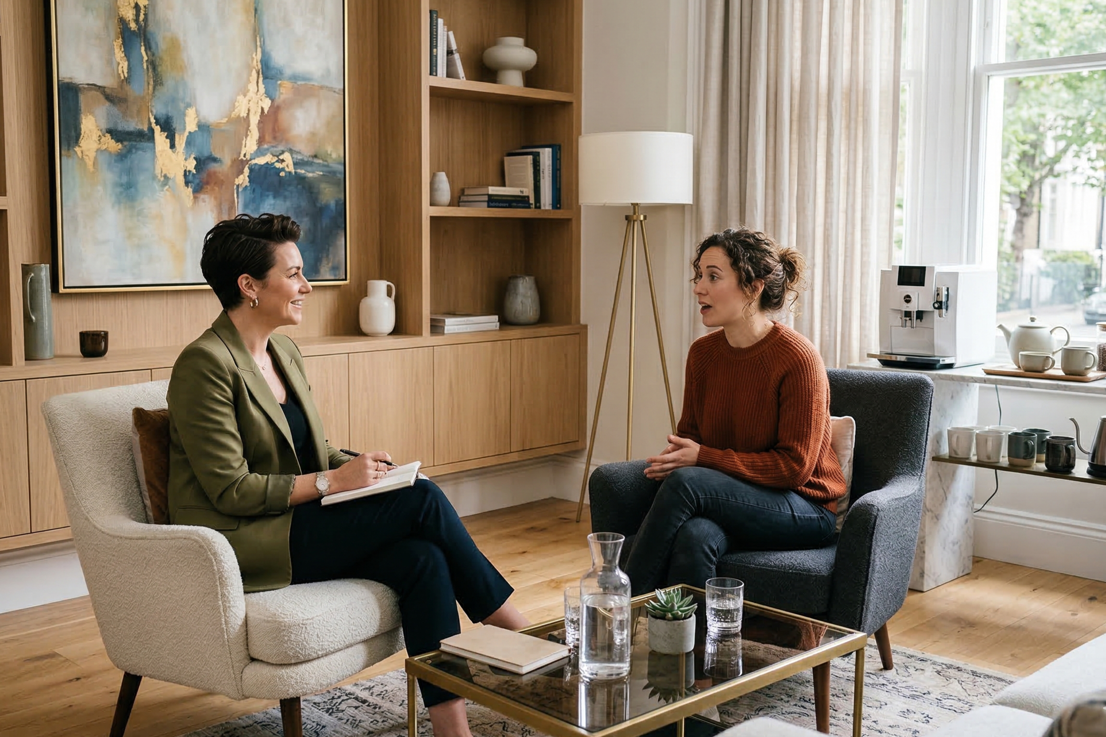
Unexpected design choices only work when they are grounded in something true about the therapist and the way they practice. When the color, layout, imagery, and tone all align with the actual experience of being in the room, the site begins to communicate more than credentials or services. It gives visitors a felt sense of what it might be like to sit across from you, to talk, and to be understood.
That kind of presence cannot be manufactured through perfection. It comes from clarity, intention, and a willingness to let your perspective show. And when that happens, the website stops feeling like marketing and starts feeling like an introduction to a real person.
Want a Website That Actually Feels Like You?
If you’re reading this and realizing your website feels a little too safe, a little too generic, or just not quite aligned with how you actually work, don’t fret. Most therapists didn’t build their sites with design strategy in mind. They built something that felt acceptable so they could move on.
A custom One-Day Website is designed to change that quickly.
In a single focused day, we clarify what makes your practice distinct, choose design elements that reflect the emotional tone of your work, and build a site that feels intentional from top to bottom. The goal is to create a website that communicates who you are before a client reads a single sentence.
By the end of the day, you walk away with a fully built, polished site that is structured well, easy for clients to navigate, and visually aligned with the experience you actually provide in the room.
If you’ve been meaning to “fix your website” for months or even years, this is a way to get it done thoughtfully without dragging the process out.
Pin it!


Some of My Favorite Private Practice Tools
Resources and Referral Links