What I Fix Most Often in Therapy Websites

Over the past few years I’ve reviewed many therapy websites through my Spend an Hour With Emily sessions. The therapists I work with are thoughtful, skilled clinicians who care deeply about helping people. The issue is almost never the quality of the therapy.
What I see much more often is that the website simply isn’t communicating clearly enough.
Website strategy is not something most therapists are taught. So even when a site is warm, sincere, and visually pleasant, it may still struggle to attract the right traffic or convert visitors into inquiries.
The encouraging news is that most therapy websites already contain the right ingredients. The work is usually about clarifying, organizing, and strengthening what is already there, not starting over.
Below are fifteen of the most common pieces of feedback I provide in my Spend an Hour With Emily sessions. If you review your site with these in mind, you will likely discover a few opportunities to make it clearer, more polished, and easier for potential clients to navigate.
1. Use Clear, Specific Headlines
The headline at the top of your homepage does a lot of work. It helps both potential clients and search engines quickly understand what your site is about.
A strong headline typically answers three questions right away:
Who you help
What you help with
Where you practice
For example:
“Anxiety and Trauma Therapy in Denver, Colorado and Online Across Colorado.”
This kind of clarity helps visitors immediately recognize that they are in the right place. It also gives Google the information it needs to show your website to the right searchers.
Warmth and personality can still follow, but clarity needs to come first.
2. Introduce Your Niche Early
Many therapists do have a niche or focus area, but it is often buried halfway down the page or mentioned only briefly.
A clear website brings your focus areas forward and repeats them in a few strategic places. Visitors should not have to search to figure out who you help.
For example, if your focus is working with women experiencing burnout and relationship stress, that focus might appear:
In the homepage headline
In your value proposition
In your services section
On your About page
When your niche appears consistently, it becomes easier for the right people to recognize themselves in your work.
3. Include a Clear Value Proposition
A value proposition explains what life might look like if therapy works.
Many therapists describe their training and their therapeutic approach beautifully. They talk about how they work and what sessions feel like. What is often harder is describing the real-world changes clients experience.
Potential clients are often wondering things like:
Will I stop overthinking everything?
Will I feel calmer in my body?
Will my relationship feel less tense?
Will I trust myself more?
Your website becomes much more compelling when it describes those kinds of changes.
4. Balance Approach With Client Outcomes
It is completely appropriate to talk about your therapeutic style and philosophy. Clients appreciate knowing how you work.
What strengthens a website is pairing that explanation with descriptions of the outcomes people experience.
For example:
Instead of only describing the approach, you might add language like:
“Over time, many clients begin to feel calmer in their daily lives, more confident setting boundaries, and more able to navigate difficult conversations.”
This helps visitors imagine what progress might feel like.
5. Repeat Location and Service Statements
A helpful practice is creating a simple tagline that summarizes your services, location, and client population.
For example:
“Therapy for anxiety and relationship stress in Seattle, Washington and online across Washington State.”
This type of statement is useful because it can be repeated in several places:
In the hero section at the top of the page
Again later in the page content
In the footer
Repeating this information reinforces clarity for both readers and search engines.
6. Use Keyword-Rich Meta Titles and Descriptions
Meta titles and descriptions are what appear in Google search results.
Each page should have its own unique meta title and description that includes relevant keywords.
For example:
Meta Title:
“Anxiety Therapy in Chicago | Sherrie Smith, LCSW”
Meta Description:
“Compassionate therapy for anxiety, burnout, and relationship stress in Chicago and online across Illinois.”
These small pieces of text have a large impact on how often people click on your website in search results.
7. Use Clear Heading Hierarchy
Heading hierarchy helps both readers and search engines understand your content.
A clear structure usually looks like this:
H1: Main page title (largest)
H2: Major section titles
H3: Subsections or taglines
H4: Used sparingly (smallest)
Paragraph/body text: Usually 16 px in size
Many therapy websites unintentionally use several different font sizes without a clear hierarchy. When headings are inconsistent, the page becomes harder to scan and Google has more difficulty interpreting the content.
A consistent hierarchy helps guide the reader’s eye through the page.
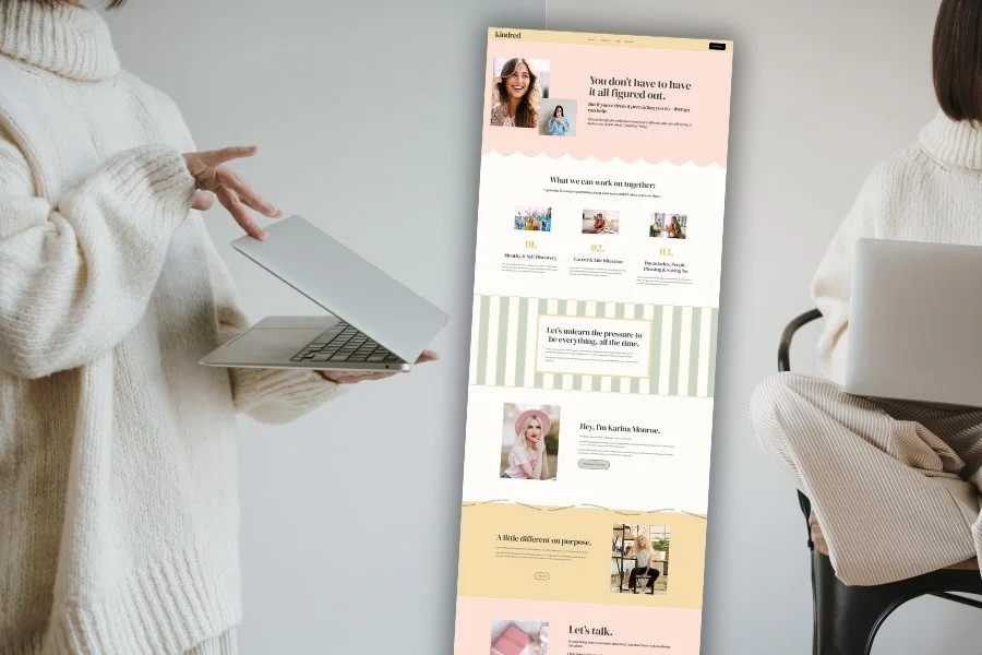
8. Maintain Consistent Design and Layout
One of the most common patterns I see is inconsistent design formatting across the site.
For example:
Margins change from section to section
Photos appear in different shapes and sizes
Spacing varies widely
Section layouts change constantly
This often happens when therapists try to create clever or unique designs for every section.
The result can unintentionally feel chaotic. The eye does not know where to go, and the site can look as though multiple designers worked on it separately.
Professional websites usually repeat three or four simple section layouts across the entire site. Consistent spacing, image shapes, and margins create visual calm and help visitors focus on the content.
9. Use Simple, Predictable Navigation Titles
Navigation labels work best when they are simple and familiar.
Visitors are usually looking for clear labels like:
Home
About
Services
FAQ
Get Started
Creative titles can feel fun to write, but they sometimes create confusion. For example, a page titled “Meet Jan” may perform less well than a page simply titled “About.”
Clarity helps visitors quickly find what they need.
10. Use Direct, Consistent Calls to Action
Calls to action guide visitors toward the next step.
A strong website chooses one primary action and repeats it consistently. Examples include:
“Book a Consultation”
“Schedule Your First Appointment”
“Get Started”
When calls to action vary from page to page, visitors may hesitate or feel unsure about what to do next.
Consistency helps remove that uncertainty.
11. Guide Visitors Toward One Main Starting Point
Another helpful practice is directing all pages toward a single starting point.
For example, many sites use a dedicated Get Started page where potential clients can:
Read about the process
Fill out a form
Schedule a consultation
When every page eventually leads toward the same starting place, the site becomes much easier to navigate.
12. Provide Clear Internal Links
Internal links help visitors explore your site naturally.
Common opportunities include:
Linking your homepage services section to each specialization page
Linking your About page to your services
Linking blog posts to relevant therapy services
Without these links, readers may reach the end of a page without knowing where to go next.
Internal links create a clear pathway through your site.
13. Choose One Communication Channel
Some websites offer many different ways to get started:
Email
Phone
Contact form
Online scheduler
Text message
While flexibility can feel helpful, too many options can sometimes create hesitation.
Most effective websites choose one primary starting method and make that process clear and simple.
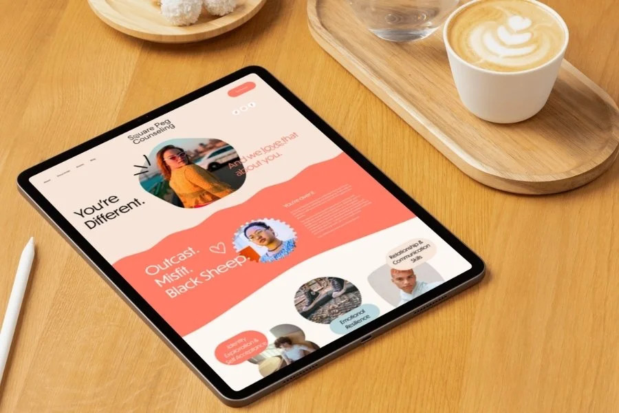
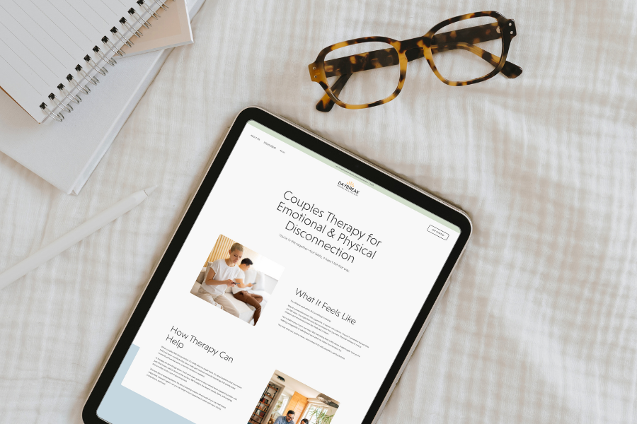
14. Use Images That Reflect Your Ideal Clients
Images are powerful signals.
When a website relies heavily on nature photography or generic stock images, it misses an opportunity to visually represent the people the therapist hopes to serve.
Ideally, website imagery should reflect the therapist’s ideal client population whenever possible.
If using client-centered images does not feel like the right fit, another option is choosing a website design that uses very few photos and instead relies on strong typography and layout. Many modern sites look elegant and professional with minimal imagery.
The key is choosing a visual strategy intentionally.
15. Align You Branding With Your Ideal Client
Your website’s colors, imagery, and overall visual style communicate something about you long before someone reads a single sentence.
When branding visuals are aligned with your ideal client population, visitors tend to feel an immediate sense that they are in the right place. When they are misaligned, the site can unintentionally send the wrong message.
For example, a therapist who works with high-achieving professionals experiencing burnout might benefit from a site that feels structured and polished. If the design instead feels playful, whimsical, or overly casual, it may not resonate with that audience.
Similarly, a therapist who primarily works with teens or young adults may unintentionally create distance if their website feels overly formal or too young.
This does not mean one design style is “better” than another. The goal is alignment. A website that feels beautiful to you should also feel relevant and welcoming to the people you hope to serve.
A Quick Website Self-Check
If you’re curious how your website is doing, take a few minutes to walk through the questions below. You don’t need every item to be perfect, but these checkpoints can help you identify where your site may benefit from a few refinements.
Messaging and Clarity
Does my homepage headline clearly state who I help, what I help with, and where I practice?
Is my niche or focus area introduced early on the page?
Do I mention my niche in multiple places across the site?
Does my website clearly describe the kinds of changes clients may experience in therapy?
Do I balance talking about my therapeutic approach with talking about outcomes for clients?
Structure and SEO
Do my pages include clear location and service statements (for example: “Therapy for anxiety in Austin, Texas and online across Texas”)?
Does each page have a unique meta title and meta description that include relevant keywords?
Does each page use a clear heading structure with one H1 and consistent H2 and H3 sections?
Do my service areas or specialties each have their own dedicated page?
Navigation and Client Guidance
Are my navigation titles clear and easy to understand (for example, “About,” “Services,” “FAQ,” or “Get Started”)?
Do my pages guide visitors toward one main starting point, such as a consultation or getting-started page?
Do I use one consistent call to action across the site?
Have I chosen one primary way for potential clients to contact me to get started?
Internal Flow
Does my homepage link to all major pages on my site?
Does my About page link to my services or specialties?
Do my blog posts link to relevant therapy services or other pages on the site?
Design and Visual Consistency
Are my margins, spacing, and section layouts consistent throughout the site?
Do I repeat the same few section layouts rather than creating a new design for every section?
Do my photos use consistent shapes and sizes?
Do my font sizes follow a clear hierarchy so headings stand out from body text?
Branding Alignment
Do my colors, imagery, and overall visual style feel aligned with the clients I hope to serve?
Do my photos reflect the kinds of people I work with, when possible?
Does the overall tone of the site match the experience of working with me?
If You Would Like Help Refining Your Website
Sometimes it is hard to see these patterns on your own website.
In a Spend an Hour With Emily session, we can review your site together and identify the highest-impact improvements.
During that hour we can:
Clarify your niche and value proposition
Strengthen your homepage messaging
Improve your SEO
Refine your navigation and internal links
Clean up formatting and design consistency
Or dig deeper into strategy if your site already has a strong foundation
The goal is to make thoughtful adjustments that help your website communicate more clearly and guide visitors more effectively. If that kind of focused support would be helpful, you can learn more or schedule a session here:
Pin it!


Some of My Favorite Private Practice Tools
Resources and Referral Links