10 Brilliant Examples of Hero Sections for Your Therapy Website Home Page

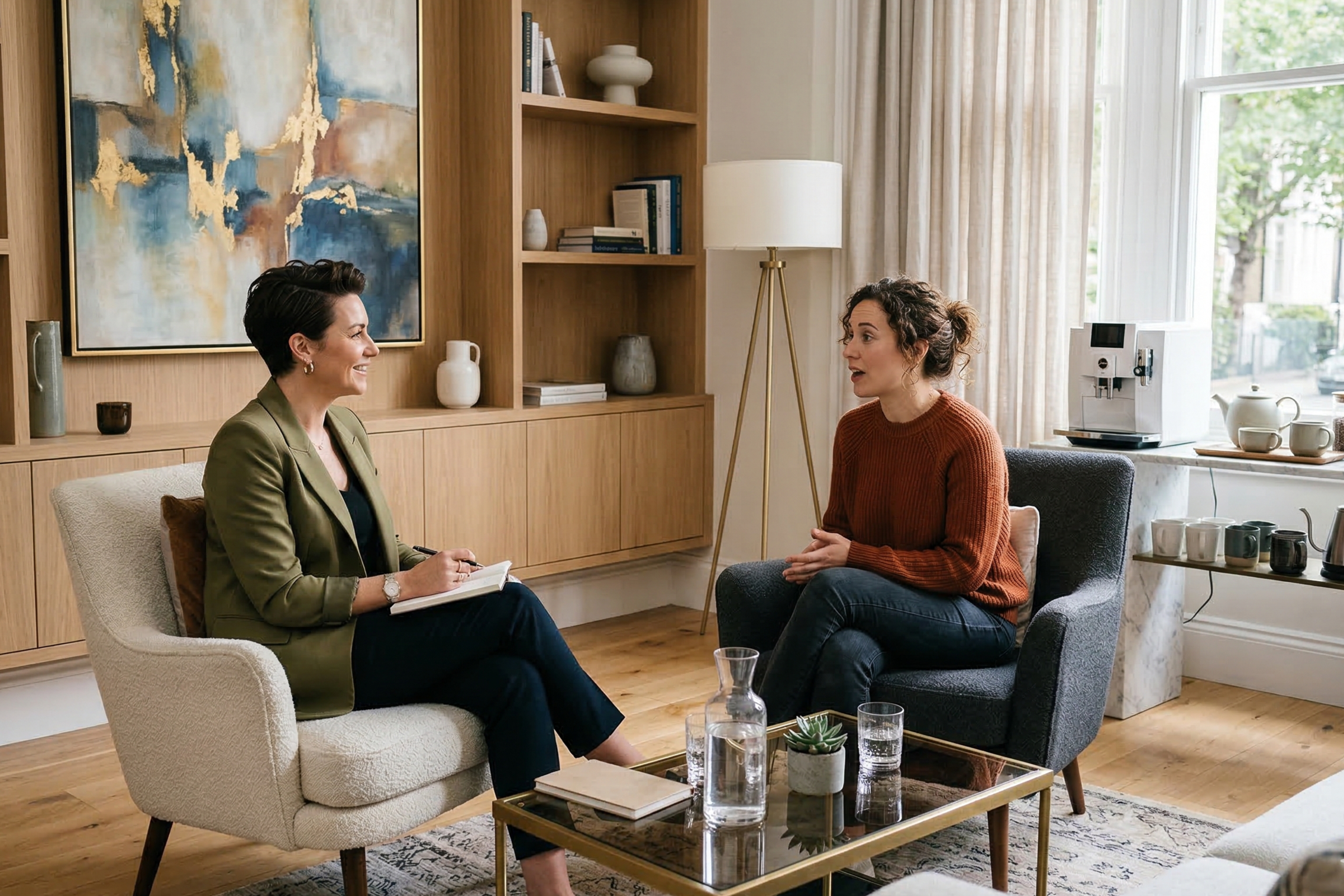
I hope I don’t need to explain why I don’t recommend a photo of a person standing on the edge of a cliff for a therapy website.
10 Brilliant Examples of Hero Sections for Your Therapy Website Home Page
Two important points I often emphasize before I get into the meat of this article:
The homepage holds paramount importance on your website.
You have mere seconds to captivate your audience's attention.
When constructing a new website for a private practice, I dedicate significant effort to designing the initial section of the homepage. This section serves as the first impression for visitors, demanding compelling content and visuals that align seamlessly with the site's overall design.
In the past, the hero area predominantly featured a full-width banner image. Today, however, there exists a multitude of innovative approaches to creating a striking opening. Below, discover ten contemporary examples to ignite inspiration for your design.
01.
www.highfivedesign.co
Your clinical focus areas are your bread ‘n butter, so why not place them right at the top of your home page? With this design, you don’t need a clever set of headlines to capture your audience’s attention. Rather, invite them to venture deeper into your website with clickable content that speaks directly to their need or problem area.
02.
www.highfivedesign.co
Large bold fonts are super on trend right now. I love how this design also adds additional visual interest by changing the color of some words. Do you also notice how the colors of the website match the photo? While your audience may not consciously detect this, they will feel it. Building connections like this throughout your website makes your content look more unified and creates flow.
03.
www.highfivedesign.co
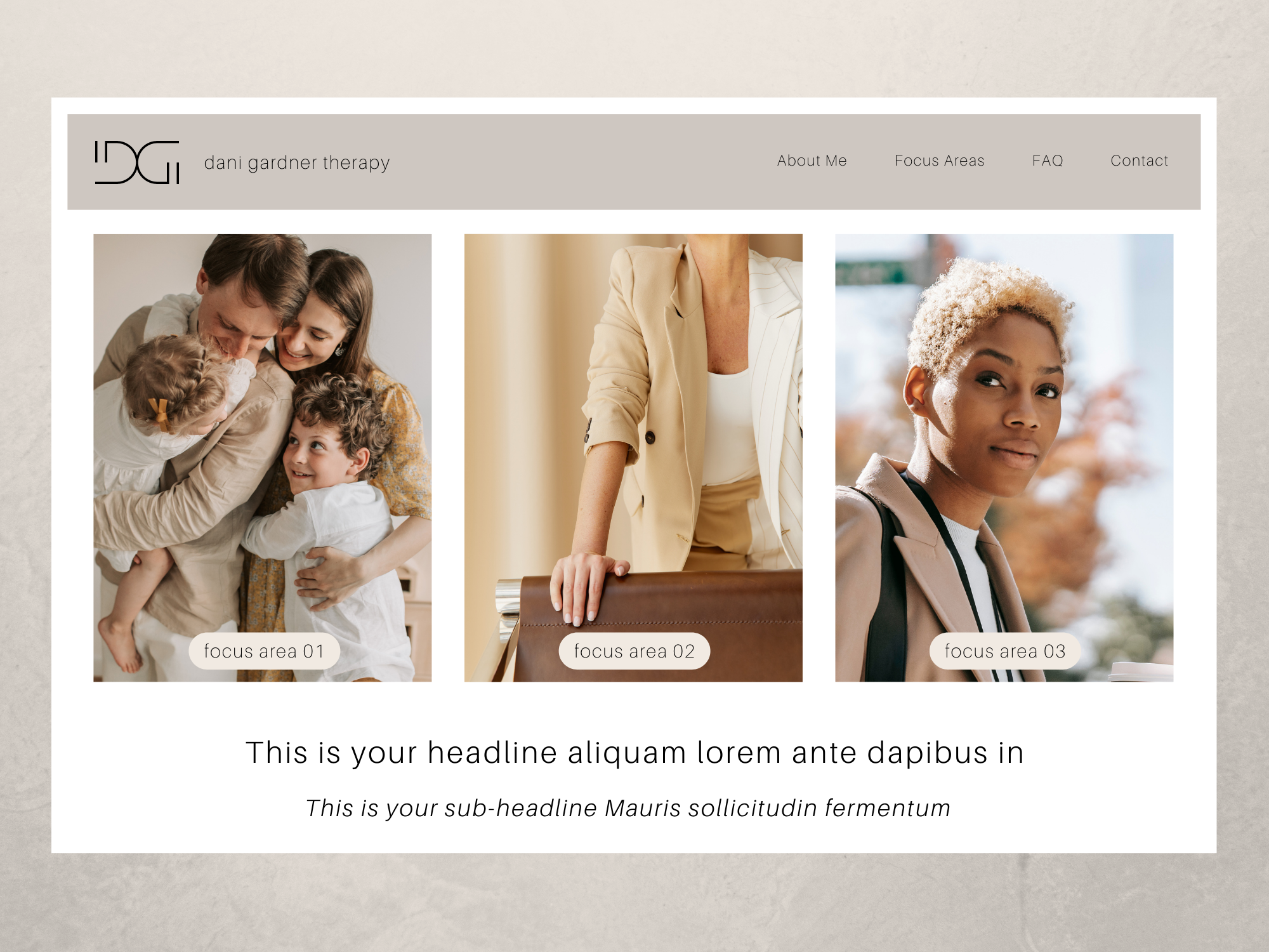
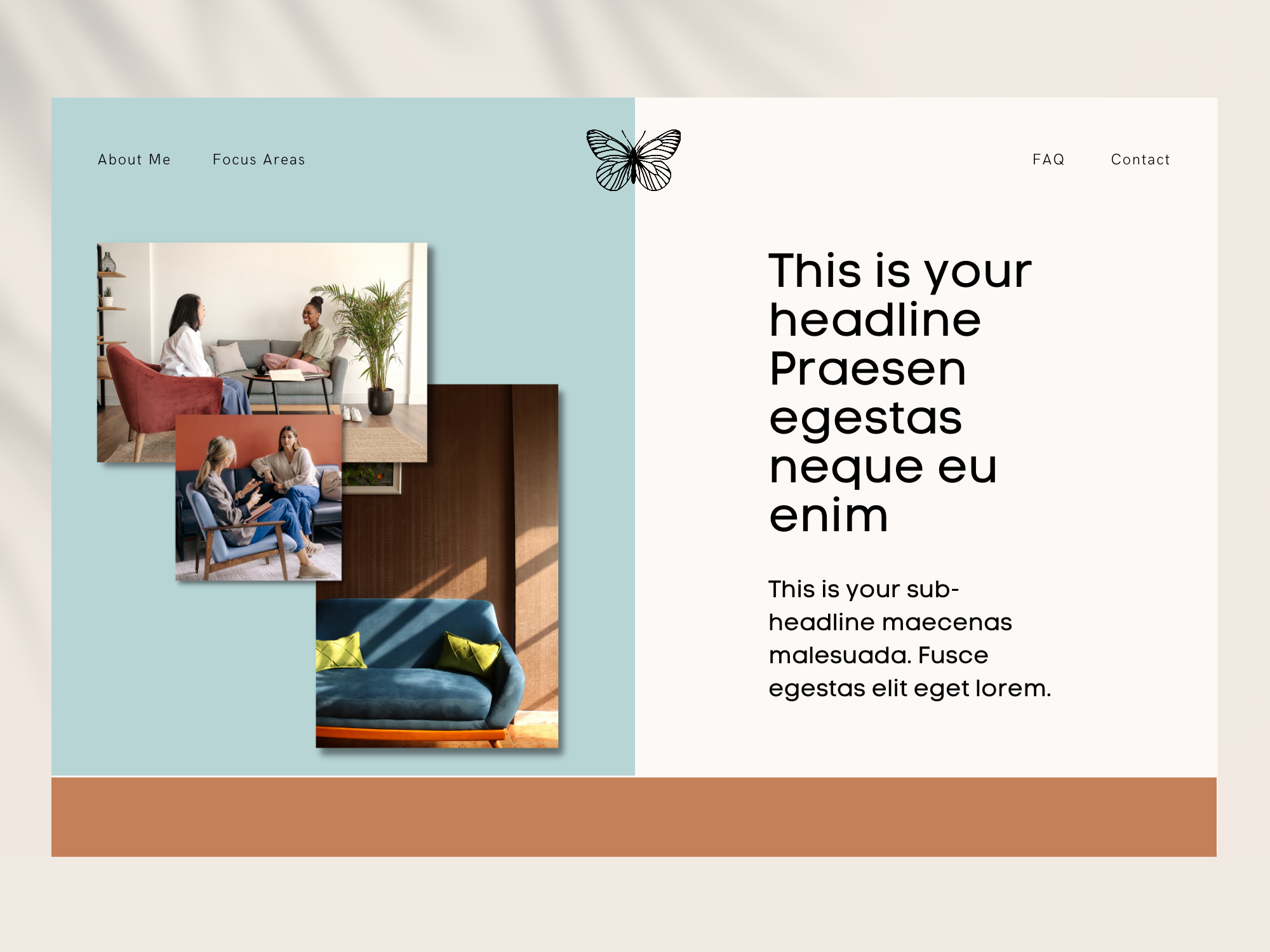
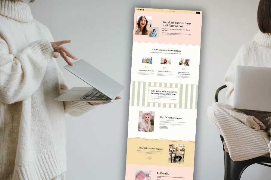
This design is relatively simple, yet the color choices, image placement, modern fonts, and unique logo set this site apart. It’s retro, stylish, and spirited. You can use any photos, but I suggest pictures representing your ideal client or office. Another fun idea would be to layer one image of you, one of your therapy dog, and one of your office! Just be sure you’re taking full advantage of the three images. You're wasting space by filling them with pictures of nature or generic things.
04.
www.highfivedesign.co
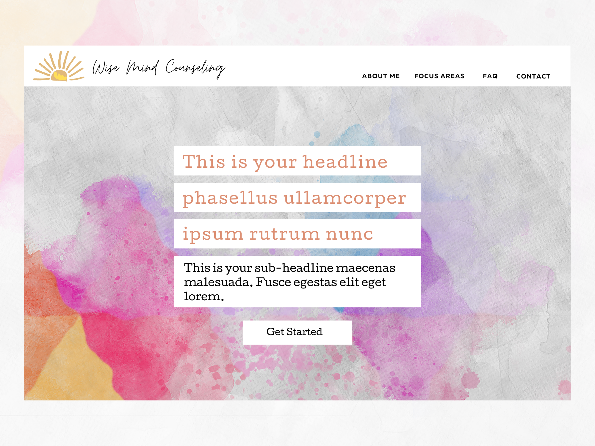
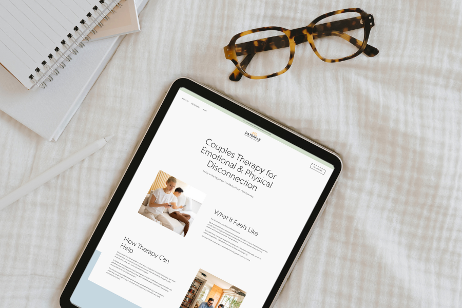
If you’re an art therapist or you work with artists, then a watercolor art background like this will speak to your ideal client. But what appeals to me most about this design is that the headlines are placed in the center with a white background behind the text. This makes the headlines stand out against the busy background. This is a great idea, no matter what kind of background image you use.
05.
www.highfivedesign.co
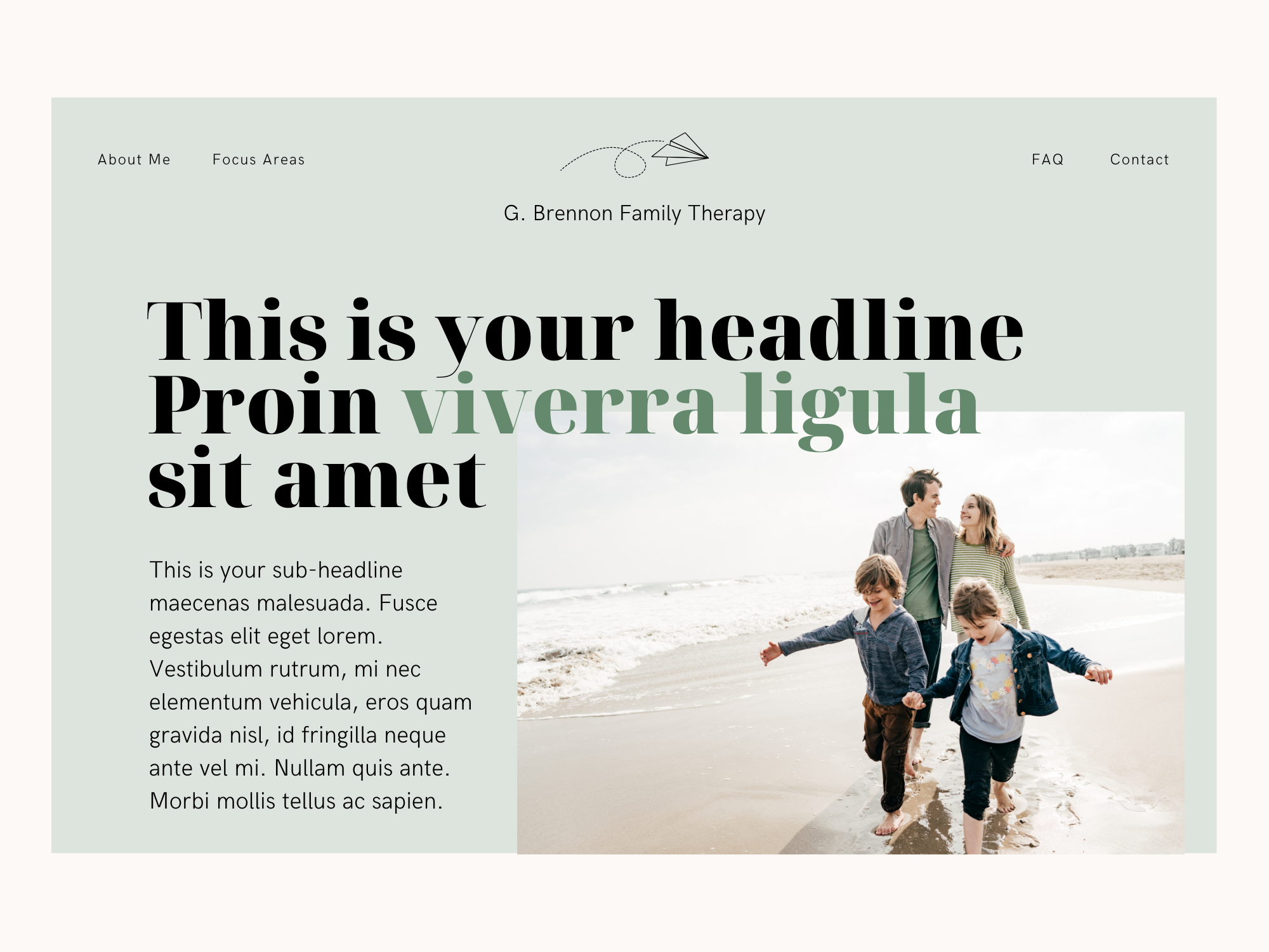
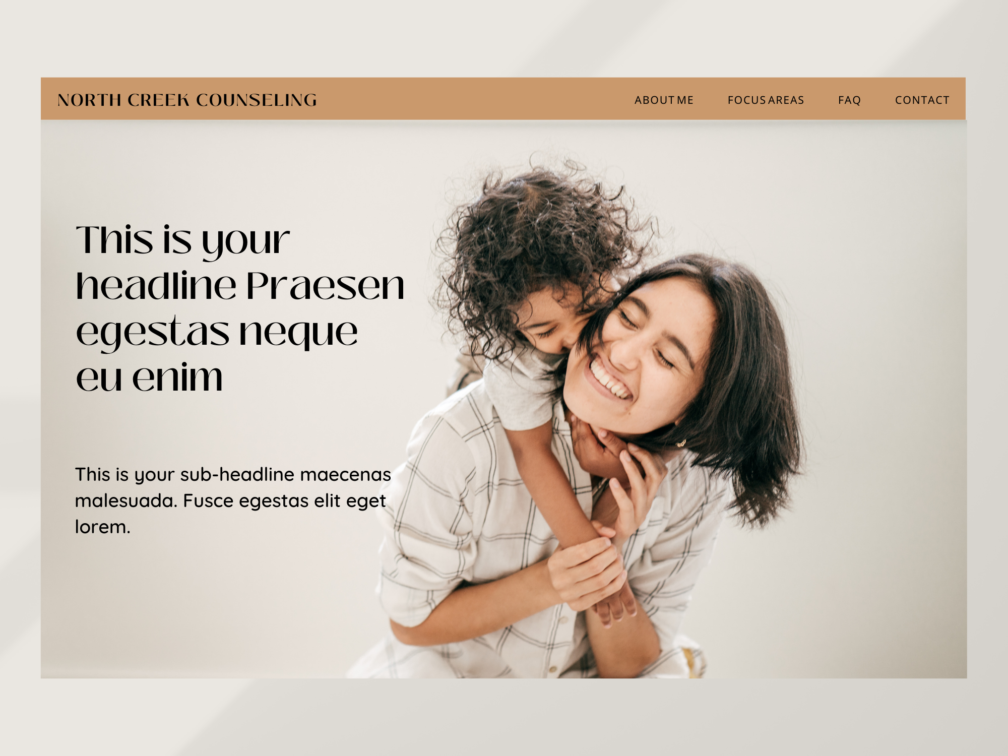
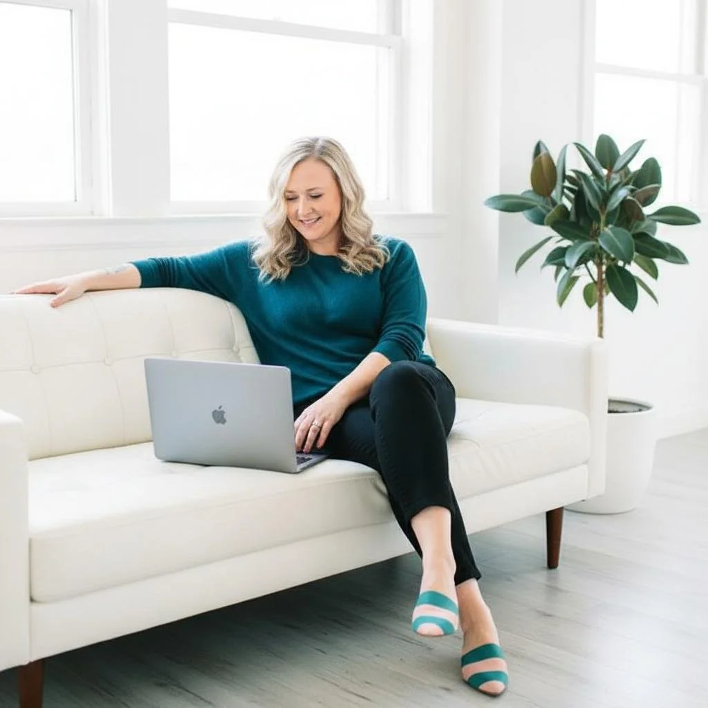
In this example, you can use an image of you (the therapist or coach) or your ideal client. The amount of blank space on either side of the people allows you to add your headline without worrying about the image getting in the way. The look is clean and straightforward, drawing attention to what’s essential.
Also, when using images of your ideal client, be sure they are smiling or have a neutral expression on their face. You want your audience to see an image of what they will feel after working with you, not how they feel now.
06.
www.highfivedesign.co
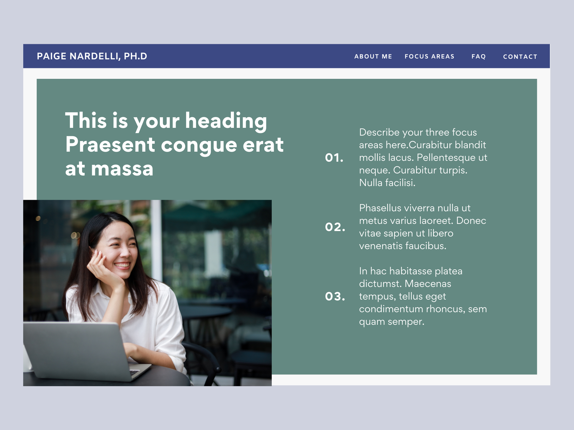
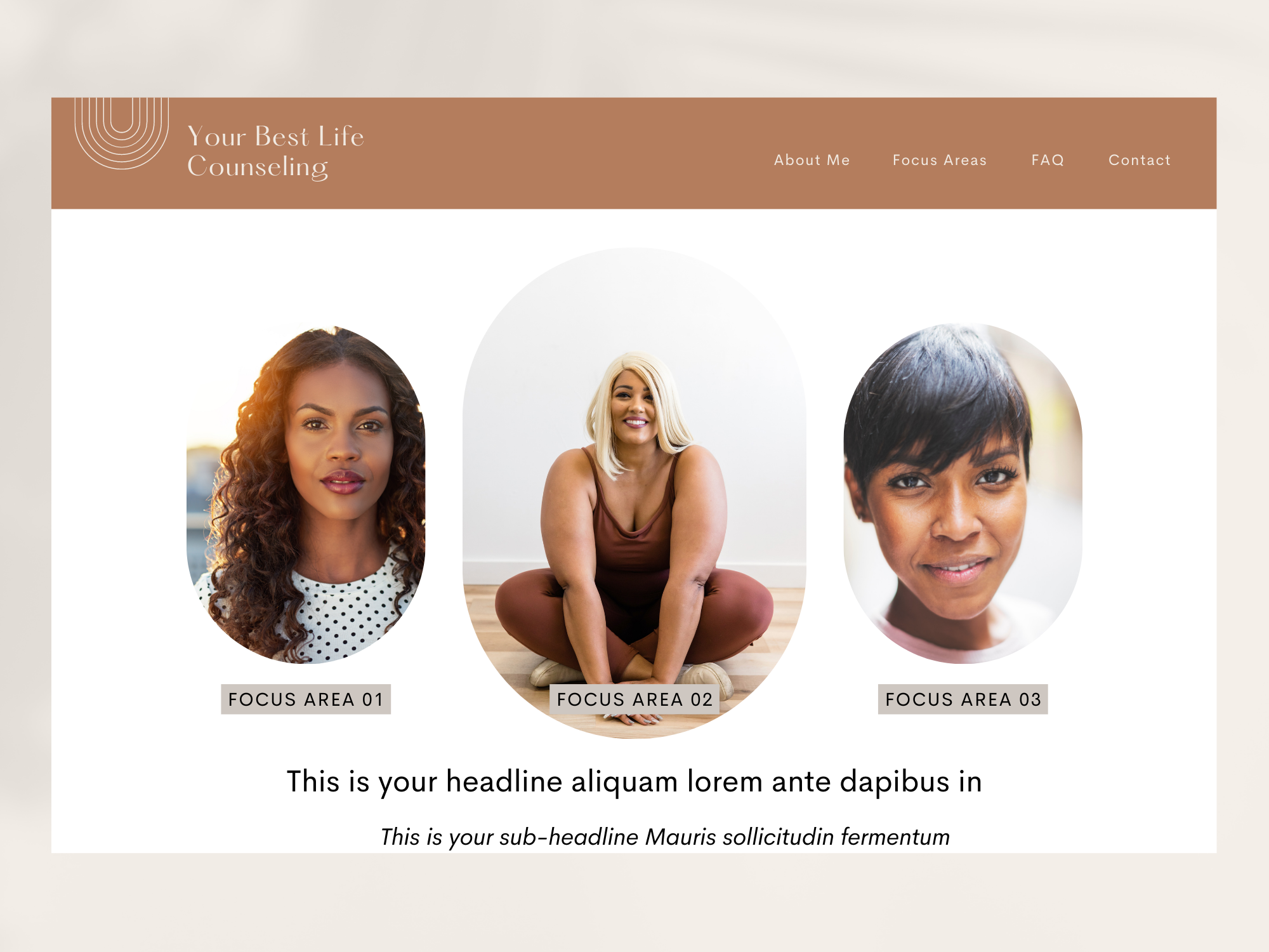
Here is another way to place your clinical focus areas in the first section, and include your headline and an image. It’s easy to clutter things up with this much content, so be sure you leave a fair amount of blank space, use a clean font, and be as concise as possible in your wording.
07.
www.highfivedesign.co
This website example draws me in right away. The images are high-quality and engaging. The rounded frames bring a contemporary and feminine vibe to the design. The headlines should be brief and convey your message clearly, to prevent undue clutter.
08.

www.highfivedesign.co
When designing your website, remember that simple is ALWAYS better. This design is a perfect example. The colors are generally soothing, but the pop of green in the headline brings cheerfulness and enthusiasm to the site. You can use a photo of yourself or your office, but a photo of the person behind the business will always be more captivating (especially for a service-based business that involves such a high degree of intimacy and connection).
09.
www.highfivedesign.co
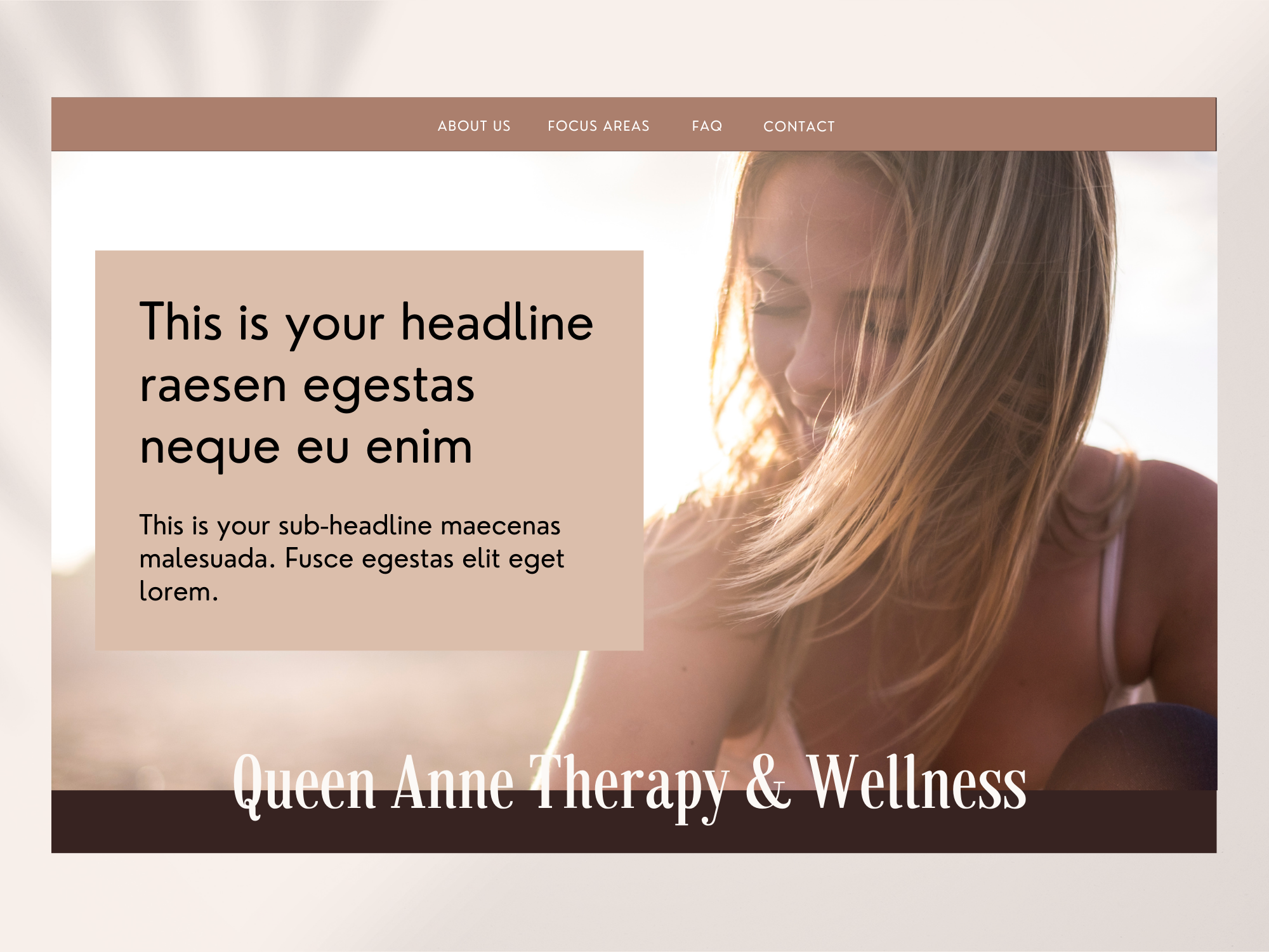
Feel free to play around with the placement of some of your elements. Like in this example, I placed the business's name at the bottom of the hero image rather than in the navigation/header area. This is an excellent idea if you want a simplistic logo (or no logo) in your navigation area. It also works if you have a one-page website.
Also, notice how the colors remain cohesive, the fonts are easy to read, and I’ve used a high-quality banner image representing the ideal client. If your headlines are difficult to read when placed over the top of a full-length banner image, place a solid color block behind the text.
10.

www.highfivedesign.co
If your branding visuals include art, drawings, or icons, you can use them on your website. This example utilizes a modern flower line drawing, making the site look more modern and high-end. I designed this with elegant yet strong, fonts and a very on-trend window-shaped (arched) image.
Need More Inspiration?
Check out these popular inspo posts:
8 Inspiring Therapist Website Examples You Need to See Right Now (2025)
5 Examples of Gorgeous Therapy & Coaching Websites to Inspire Your Design
My Favorite Design Hacks for Customizing Your Squarespace Website
From Calm to Captivating: 10 Unexpected Color Palettes for the Modern Therapy Website
10 Gorgeous Color Combinations to Try on Your Therapy or Coaching Website
24 Awesome Brand Moodboards to Inspire Your Therapist Website Design


My Favorite Private Practice Tools
Resources and Referral Links